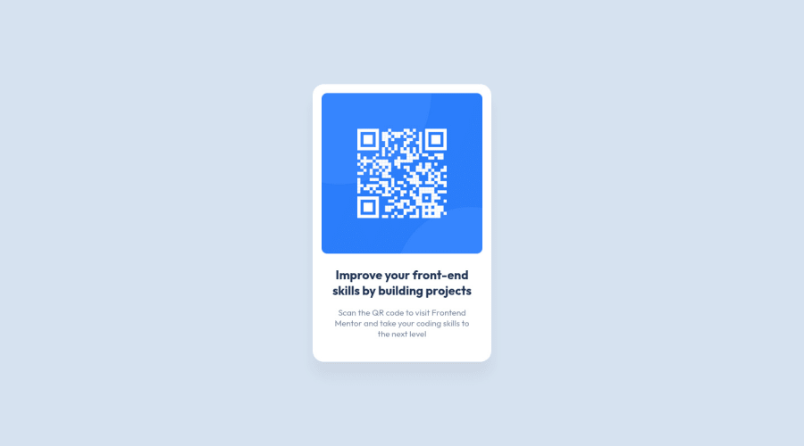
Design comparison
Community feedback
- @HassiaiPosted over 1 year ago
To center .container on the page using flexbox, replace the height in the main with min-height: 100vh.
For a responsive content, there is no need to give .container a height value, replace its width with max-width and give the img a max-width of 100% instead of a width and height values..
Give h1 and p the same font-size of 15px which is 0.9375rem and the same margin-left, margin-right and margin-top values. Give p a margin bottom value.
Hope am helpful.
Well done for completing this challenge. HAPPY CODING
0@anerpecoPosted over 1 year ago@Hassiai Thanks for your feedback. Give h1 and p the same font size??? Interesting
0 - @Akhil-NagpalPosted over 1 year ago
Hello Aner! Congratulations on completing this challenge.
You did a great job. This solution is perfect.
Except for the height of the card. I think the size of the card should be
31rem, and this will bring it down to the perfect size of the card.I hope this will help.
Congratulations Again! Happy Coding!
0
Please log in to post a comment
Log in with GitHubJoin our Discord community
Join thousands of Frontend Mentor community members taking the challenges, sharing resources, helping each other, and chatting about all things front-end!
Join our Discord
