Design comparison
SolutionDesign
Solution retrospective
What are you most proud of, and what would you do differently next time?
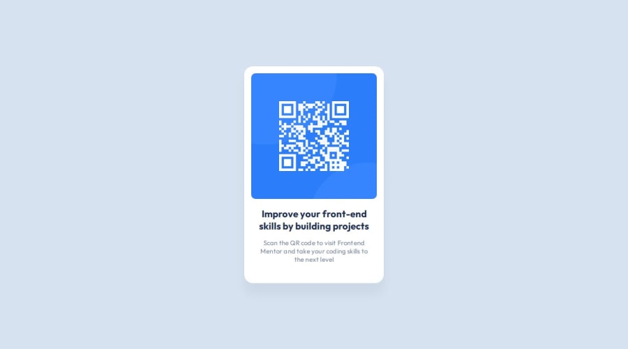
First time working from Figma and I think I got this pretty close to the design file . I started off using root styling also for the first time.
What challenges did you encounter, and how did you overcome them?The padding and margin to get it matching the design file as I couldn't see that the exact sizes are in the style guide. I created small, medium, large root styles and calculated 320px wide container against the 288px image size to find the padding size.
What specific areas of your project would you like help with?would like feedback on html structure and css decisions..what could I improve also did I miss anything from the figma design file?
Community feedback
Please log in to post a comment
Log in with GitHubJoin our Discord community
Join thousands of Frontend Mentor community members taking the challenges, sharing resources, helping each other, and chatting about all things front-end!
Join our Discord
