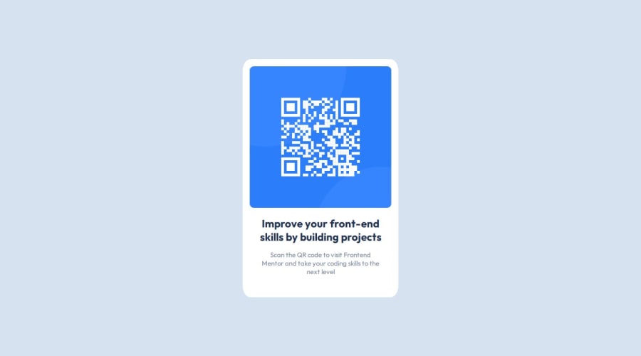
Design comparison
SolutionDesign
Solution retrospective
What are you most proud of, and what would you do differently next time?
How smooth it went, don't stress too much but pay attention to the figma file.
What challenges did you encounter, and how did you overcome them?Struggled a bit with the border radius on my Qr-code image. Went to look for some help online and after that it all went good.
What specific areas of your project would you like help with?To see if its accurate and how i could use figma better to get the design 100% spot on.
Community feedback
- @0xabdulkhaliqPosted 8 months ago
Hello there 👋. Congratulations on successfully completing the challenge! 🎉
- I have a suggestion regarding your code that I believe will be of great interest to you.
DESIGNING USING PIXEL PERFECT 🖼️:
- how i could use figma better to get the design 100% spot on?, Yeah we can do that.
- You can use an extension called Pixel Perfect, It would help you to place the design images provided by FEM to place that on top your website where you can compare yours with design image.
- You can see the results of using Pixel Perfect for
my submission
as an example of how it helps us to design much better looking websites.
- If you have any questions or need further clarification feel free to reach out to me.
.
I hope you find this helpful 😄 Above all, the solution you submitted is great !
Happy coding!
Marked as helpful0
Please log in to post a comment
Log in with GitHubJoin our Discord community
Join thousands of Frontend Mentor community members taking the challenges, sharing resources, helping each other, and chatting about all things front-end!
Join our Discord