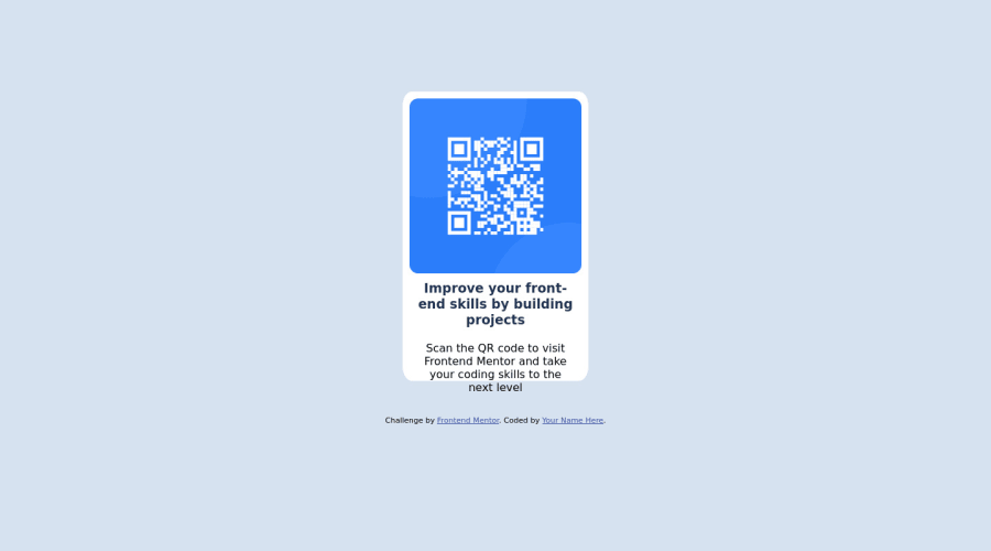
Design comparison
SolutionDesign
Community feedback
- @anoshaahmedPosted almost 3 years ago
hey good job on this challenge! your report above shows a few issues though:
- wrap everything in your body in
<main>OR use semantic tags! if you're usingdivright afterbody, then give them arole=""; however, it's a little frowned upon to useroleright after body, so try to stick with semantic tags instead. you can read more about landmarks here - you should have at least one
<h1>in your webpage
here is a list i made of accessibility issues & best practices
hope this helps :))
Marked as helpful0 - wrap everything in your body in
- @victoralbenorPosted almost 3 years ago
Try changing your card div to "main" to fix accessibility issues. I would advise increasing the card width as well. Almost there!
Marked as helpful0
Please log in to post a comment
Log in with GitHubJoin our Discord community
Join thousands of Frontend Mentor community members taking the challenges, sharing resources, helping each other, and chatting about all things front-end!
Join our Discord
