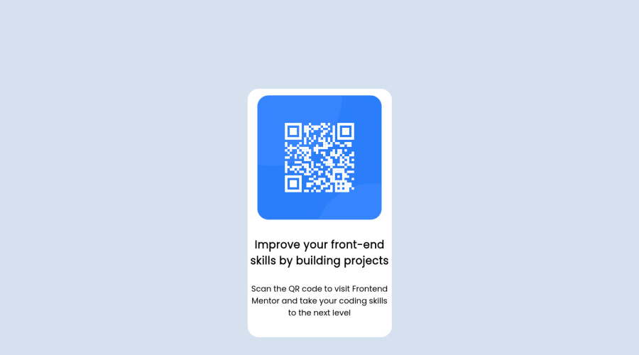
Design comparison
Solution retrospective
Hey all! I recently finished a course that included HTML/CSS/CSS flexbox, and JS. It's been a while since I've done anything with just HTML and CSS, so I'm admittedly a little rusty and trying to get back in the habit of using it! Any feedback on this challenge would be very appreciated, I know there's likely some spacing/centering issues with my code. Thanks!
Update: Thanks for everyone's feedback so far! I tweaked a few things and improved my design a bit, I would love to know what y'all think! For some reason, my GH Page is not updating with the changes I made. I did try to push the changes through to the page branch. Has anyone else had this happen?
Community feedback
- @karenefereyanPosted almost 3 years ago
HI Sarah. I love the simplicity of your approach. Beautiful. Here's something I just wanted to point out.
- It is always a good idea to stick to separation of concerns in web development. That would mean to let html handle everything structure, while css handles everything styling. It might be negligible for this particular projects but in bigger projects, letting each pillar(HTML || CSS || JS) handle their own concerns will help with organization.
Keep going!!!!
Marked as helpful1 - @willettoPosted almost 3 years ago
Two things will help with the spacing of the words. First, the style guide said the <p> should be 12px. Second, you can style the <p> and <h4> tags with width as a percentage. That percentage will relate to the parent element (the white box).
Try adding something like this to both: h4 { width: 90% ; }
Marked as helpful0 - @MNRSkillsPosted almost 3 years ago
Not overthinking it, keeping it simple, excellent work.
Marked as helpful0
Please log in to post a comment
Log in with GitHubJoin our Discord community
Join thousands of Frontend Mentor community members taking the challenges, sharing resources, helping each other, and chatting about all things front-end!
Join our Discord
