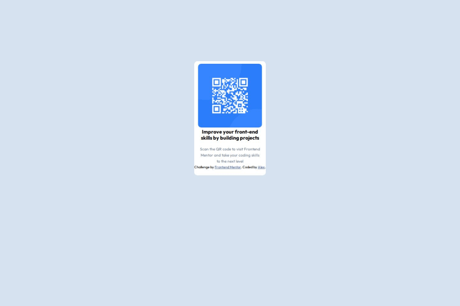


Design comparison

Solution retrospective
I really liked that I was able to understand how to implement flex and widths into my design in order to avoid making unnecessary responsive media queries. When it comes to the margin and padding I added, I think there are better solutions to get the desired design, however, I'm not sure yet.
What challenges did you encounter, and how did you overcome them?The most difficult challenge for me was getting the margins of the card to not over extend and ruin the design. This was especially hard in the white background, because when I checked the site in phone width, it was really broken, but I managed to fix it by investigating more about how to manipulate the width and height.
What specific areas of your project would you like help with?How can I make my design be responsive without the use of media queries? In the case of the widths and heights, is there a function that allows me to make the design responsive more easily instead of establishing a predetermined max height or width?
Community feedback
Please log in to post a comment
Log in with GitHub
Join our Discord community
Join thousands of Frontend Mentor community members taking the challenges, sharing resources, helping each other, and chatting about all things front-end!
Join our Discord