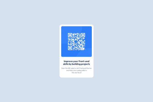
Design comparison
Solution retrospective
Didn't have any problems here. If you have any remarks about my solution, please let me know, I'll give them attention
Community feedback
- @0xabdulkhaliqPosted over 1 year ago
Hello there 👋. Congratulations on successfully completing the challenge! 🎉
- I have other recommendations regarding your code that I believe will be of great interest to you.
QR iMAGE ALT TEXT 📸:
- The QR Code Component involves scanning the QR code, the image is not a decoration, so it must have an
alt
attribute which should explain the purpose of theimage
.
- The
alt
withqr-Code
is not even explaining for what the QR image need to be used.
- So update the
alt
with meaningful text which explains likeQR code to frontendmentor.io
- Example:
<img src="/images/image-qr-code.png" alt="QR code to frontendmentor.io">
.
I hope you find this helpful 😄 Above all, the solution you submitted is great !
Happy coding!
Marked as helpful0 - @Ali-TofiqiPosted over 1 year ago
Hello coder
Congratulations on submitting your solution
your code is perfect, I think it will be a good option to add the color background to your body element instead .main it can have a better look on a very small size of the screen because the entire page has one color.
Marked as helpful0@AndriiIladiiPosted over 1 year ago@Ali-Tofiqi Thanks a lot for advice. I really appreciate it=)
0
Please log in to post a comment
Log in with GitHubJoin our Discord community
Join thousands of Frontend Mentor community members taking the challenges, sharing resources, helping each other, and chatting about all things front-end!
Join our Discord