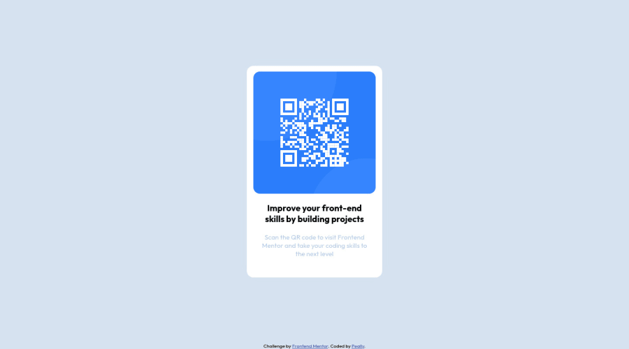
Design comparison
Solution retrospective
I had some issue to find the way to put the card with a horizontal align
Community feedback
- @GregLyonsPosted over 2 years ago
Good work! Here are some tips on aligning things horizontally:
margin: auto;can work to center content horizontally, but it also applies to the top and bottom margins as well, as it is a shorthand property for (in order):margin-top,margin-right,margin-bottom, andmargin-left. This can be a problem if you don't want to setmargin-top/margin-bottomto those values. Thus, using eithermargin-left: auto; margin-right: auto;or
margin-inline: auto;is preferable.
Using margins often requires you to explicitly set the width of an element, which you may not want (especially for responsive design). Flexbox gives you a more robust way to horizontally center content. On the parent element of the children you want to center, apply
display: flex;
justify-content: center;
To center your card (
.whitebox), for example, you could put the above code on the<body>. Usually you'll probably need to space out the children (e.g. with thegapproperty), as they'll be put next to each other horizontally. Another solution that avoids this, again using Flexbox, isdisplay: flex; flex-direction: column; align-items: center;Of course, if you want your Flex children to be in a row, you can't use
flex-direction: column;. You can learn more about Flexbox here. I recommend you learn it, as it's very useful. You don't need to understand everything right away; you'll master it through using it in your future projects.The other tip I'd give is to work on using semantic HTML. That includes using header elements (
<h1>-<h6>) for your headers,<p>elements for your text, and so on. This makes your web page more understandable to search engines (for SEO purposes) and screen readers (for accessibility). In your solution, I'd say your.textis an<h1>or an<h2>(every page should have an<h1>element, so probably the former; but if this component were placed in a larger context it'd probably be a lower-level heading), and your.text2is a<p>.Using semantic HTML is also very important for forms and buttons, not just for the above reasons, but also because the
<button>,<input>, etc. elements have a lot of keyboard functionality built-in by default. If you were to just use<div>s instead, you would have to code all that keyboard functionality yourself (or give it up altogether, which wouldn't be acceptable for most sites).I hope that helps. If so, feel free to Mark this comment as Helpful. Either way, good job again, and best of luck on your future projects!
Marked as helpful0@PeallyzPosted over 2 years ago@GregLyons Thanks a lot for these tips I tried to correct my code to do a better one Everything you said will help me for sure on my future projects !
ps: using sementic like <h1> at the end of the project wasn't a good idea, i need to think more about my html at the beggining cause of the default CSS values.
Have a nice day
1@GregLyonsPosted over 2 years ago@Peallyz Glad it helped! :)
If you inspect an element such as an
<h1>, you should be able to see what CSS rules, including default rules, are being applied to the element. So I believe there's some defaultmargin-block-startandmargin-block-endon the<h1>, which you could set to 0. In my experience, you'll want usually want to override the defaults.In fact, sometimes you'll have a case where you have two headings, which semantically are a
<h2>and an<h3>, but in the visual design the<h3>is actually bigger (but maybe there are some other visual elements like position, font weight, etc. which make the<h2>visually more like a second-level heading vs. the third-level heading<h3>). In this case, you'd need to change the default font sizes.Whenever you get time, you should check out CSS Resets. Here's one that I like to use, with justification for each property. You could write your own as well, though. Essentially they remove a lot of the default formatting on HTML elements (as well as some other useful stuff), so that you don't have to worry about which default paddings/margins you need to use.
Marked as helpful0
Please log in to post a comment
Log in with GitHubJoin our Discord community
Join thousands of Frontend Mentor community members taking the challenges, sharing resources, helping each other, and chatting about all things front-end!
Join our Discord
