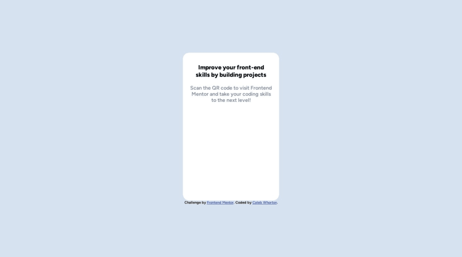
Design comparison
Solution retrospective
Initially I found centering the box to the center difficult - i was missing the min-height in the body.
I would be grateful for some advice on any improvements/best practices that i could use to improve my code.
Community feedback
- @MelvinAguilarPosted 11 months ago
Hello there 👋. Good job on completing the challenge !
I have some suggestions about your code that might interest you.
- Change the file path of the image to display it.
✅ Do:
<img src="./images/image-qr-code.png" alt="" width="200px" class="qr" >. ❌ Don't:
<img src="https://github.com/CalebWhorton12/qr-code-component-main/blob/main/images/image-qr-code.png" alt="" width="200px" class="qr">.- Use semantic elements such as
<main>and<footer>to improve accessibility and organization of your page.
- Always avoid skipping heading levels; Starting with <h1> and working your way down the heading levels (<h2>, <h3>, etc.) helps ensure that your document has a clear and consistent hierarchy. Source 📘
I hope you find it useful! 😄 Above all, the solution you submitted is great!
Happy coding!
Marked as helpful0
Please log in to post a comment
Log in with GitHubJoin our Discord community
Join thousands of Frontend Mentor community members taking the challenges, sharing resources, helping each other, and chatting about all things front-end!
Join our Discord
