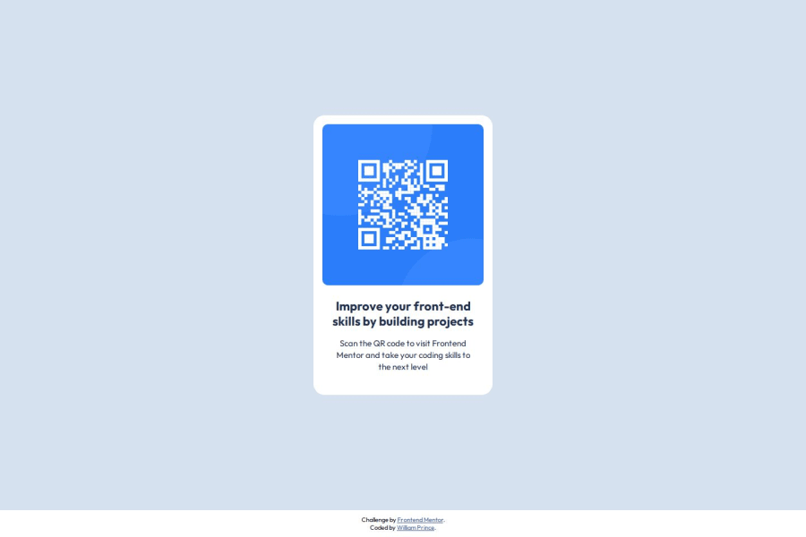


Design comparison

Solution retrospective
I have done it quickly but I don't know if I used the correct HTML semantic or if I named mthe class correctly.
What challenges did you encounter, and how did you overcome them?I was not sure how to use typography inside my style.css. Do I have to create class that contain the typo or should I style the specific element. For exemple shoud I style my or use a class? What is the best practice?
What specific areas of your project would you like help with?Sementic and style.css design system best practice. I want to know what is the best pratice.
Community feedback
- P@StroudyPosted 7 months ago
Amazing job with this! You’re making fantastic progress. Here are some small tweaks that might take your solution to the next level…
-
Using
!importantis not recommended because it overrides all other styles, making debugging and maintenance difficult, causing conflicts, reducing flexibility, and limiting the ability to create scalable, modular CSS. -
Line height is usually unitless to scale proportionally with the font size, keeping text readable across different devices. Best practice is to use a unitless value like
1.5for flexibility. Avoid using fixed units likepxor%, as they don't adapt well to changes in font size or layout. -
Using
max-width: 100%ormin-width: 100%is more responsive than justwidth: 100%because they allow elements to adjust better to different screen sizes. To learn more, check out this article: responsive-meaning. -
Developers should avoid using pixels (
px) because they are a fixed size and don't scale well on different devices. Instead, useremorem, which are relative units that adjust based on user settings, making your design more flexible, responsive, and accessible. For more information check out this, Why font-size must NEVER be in pixels or this video by Kevin Powell CSS em and rem explained.- Another great resource for px to rem converter.
Keep building on your knowledge, and remember, every step forward is progress. You’re on the right track, and you’re doing great. Have an awesome day and happy coding! 😊
1 -


Please log in to post a comment
Log in with GitHub
Join our Discord community
Join thousands of Frontend Mentor community members taking the challenges, sharing resources, helping each other, and chatting about all things front-end!
Join our Discord