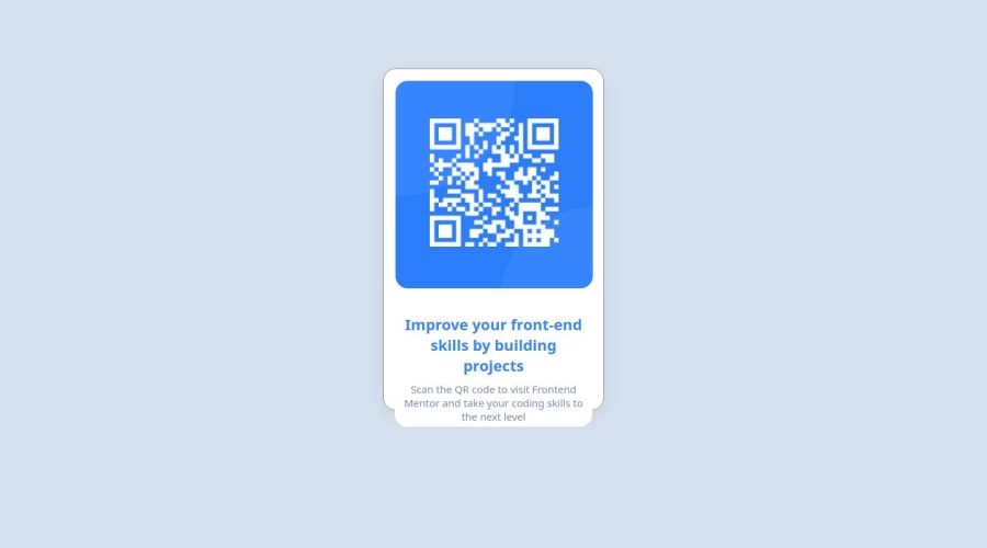
qr-code card component
Design comparison
Solution retrospective
I've gained valuable insights into creating responsive web designs with fonts and images. Moving forward, I'm eager to explore integrating 3D card elements into my projects. This additional dimension promises to enhance both the visual appeal and user experience of my designs.
What challenges did you encounter, and how did you overcome them?When facing the challenge of positioning components at the center of the screen, I explored various methods to achieve this, such as utilizing "display: flex;" with "justify-content: center;", and employing "position: absolute;" with "top: 50%;" and "left: 50%;" alongside "transform: translate(-50%, -50%);". Through experimentation and research, I successfully implemented these techniques to ensure the desired center alignment of the components on the screen.
What specific areas of your project would you like help with?I appreciate the offer, but for now, I prefer to tackle challenges and find solutions on my own. Thank you for understanding.
Community feedback
Please log in to post a comment
Log in with GitHubJoin our Discord community
Join thousands of Frontend Mentor community members taking the challenges, sharing resources, helping each other, and chatting about all things front-end!
Join our Discord
