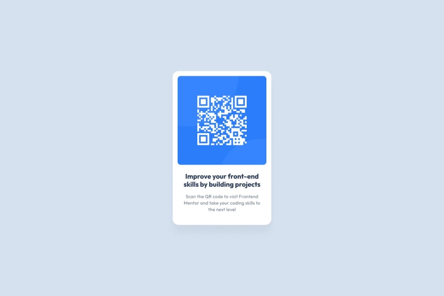
Design comparison
SolutionDesign
Community feedback
- @tuhamworldPosted about 1 month ago
Great Job on attempting to build the QR Component Solution.
I have a few suggestions as regards the solution.
Here's a screenshot of some of the things I noted (Screenshot here - https://prnt.sc/Eo-gjK84KjOZ )
- The background color of the entire body is not the same
- The font family and font size of the header title is quite different from the one in the style guide
- The font properties of the description are quite different as well.
- There's a white spacing between the text description and the wall of the main container. You can use margin/padding to control it.
- The spacing between the QR code picture and the wall of the container is a bit wide.
Let me know if you found this helpful Do not hesitate to reply if you want me to explain further on any of the above comments
0
Please log in to post a comment
Log in with GitHubJoin our Discord community
Join thousands of Frontend Mentor community members taking the challenges, sharing resources, helping each other, and chatting about all things front-end!
Join our Discord
