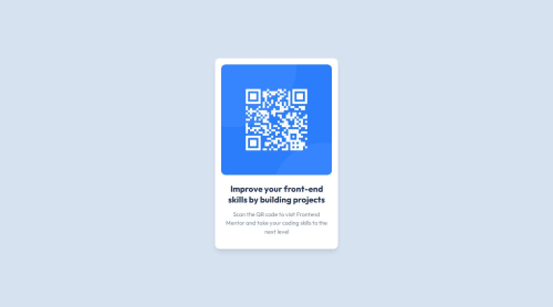
Submitted over 1 year agoA solution to the QR code component challenge
QRCode
react, tailwind-css, vite
@nyanSpruk

Solution retrospective
What are you most proud of, and what would you do differently next time?
That i am getting better at this. I am getting used to grid and flex slowly
What challenges did you encounter, and how did you overcome them?Getting the gap spacing of text exact.
What specific areas of your project would you like help with?What would be the best way to compare my and expected results, so that i dont waste my monthly screenshots? Thats my biggest hurdle
Code
Loading...
Please log in to post a comment
Log in with GitHubCommunity feedback
No feedback yet. Be the first to give feedback on Nik Jan Špruk's solution.
Join our Discord community
Join thousands of Frontend Mentor community members taking the challenges, sharing resources, helping each other, and chatting about all things front-end!
Join our Discord