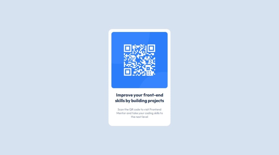
Design comparison
SolutionDesign
Community feedback
- @0xabdulkhaliqPosted 7 months ago
Hello there 👋. Congratulations on successfully completing the challenge! 🎉
- I have a suggestion regarding your code that I believe will be of great interest to you.
HEADINGS ⚠️:
- This solution lacks usage of
<h1>so it can cause severe accessibility errors due to lack of level-one headings<h1>
- Every site must want only one
h1element identifying and describing the main content of the page.
- An
h1heading provides an important navigation point for users of assistive technologies, allowing them to easily find the main content of the page.
- So we want to add a level-one heading to improve accessibility by reading aloud the heading by screen readers, you can achieve this by adding a
sr-onlyclass to hide it from visual users (it will be useful for visually impaired users)
- Example:
<h1 class="sr-only">QR code component</h1>
- If you have any questions or need further clarification then feel free to reach out to me.
.
I hope you find this helpful 😄 Above all, the solution you submitted is great !
Happy coding!
Marked as helpful0@vitorjoaorrPosted 7 months ago@0xabdulkhalid hello Abdu! thanks for your comment, I really appreciate your tips, but I didn't really understand what you meant, I'm new here and my English isn't the best ;D, you meant to say that my code has a problem accessibility? where in the code should I put <h1 class="sr-only">QR code component</h1>? thanks again!
0 - @RyanDillon94Posted 7 months ago
Almost identical! Awesome work :D
0
Please log in to post a comment
Log in with GitHubJoin our Discord community
Join thousands of Frontend Mentor community members taking the challenges, sharing resources, helping each other, and chatting about all things front-end!
Join our Discord
