


@VCarames
Posted
Hey there! 👋 Here are some suggestions to help improve your code:
-
To not only improve your HTML’s code but to identify the main content of you page, you will want to wrap your entire component inside the
Mainelement. -
To properly center your content to your page, you will want to add the following to your
BodyElement (this method uses CSS Grid):
body {
    min-height: 100vh;
    display: grid;
    place-content: center;
}
-
Reduce the
border-radiusto better match the FEM design. -
Change
widthtomax-width: 100%in your image to make it responsive. -
A
Media Queryis not needed for this challenge. Using responsive properties will do in making your content responsive.
If you have any questions or need further clarification, feel free to reach out to me.
Happy Coding! 🍂🦃
@devwasif
Posted
@vcarames Hi,
Thanks for highlighting the points, I will consider them and fix them.
@devwasif
Posted
@vcarames Hi,
Check it out, I did solve responsive issue and improve code.
@VCarames
Posted
@devwasif
Looks good! Great job!
Don't forget to add the main element. You can delete this <div class="container">, it's not necessary.
You can then change this <div class="card"> to a main element instead.
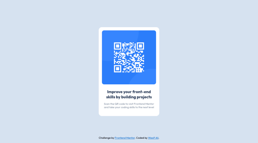
I forgot to add it in the previous comment but you will want to update the Alt Tag for the NFT image; it needs to tell screen reader users what it is and where it will take them to when they scan it.
