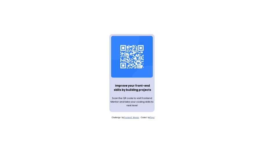
Design comparison
Solution retrospective
I spent like 4 hours and did lots of research I tried to flex and position and in the end, I know how to use both flex and position at the same time It was a good project for a person who started learning web dev, I hope that looks good and I did my best in that Thank you ALL
Community feedback
- @jmadiliaPosted about 1 year ago
Nice alignment of the container, image, and text.
You mentioned using Flex. For more information on Flex and other helpful alignment best practices, I recommend checking out the Mozilla Developer Network documentation for CSS if you haven't already. There is a great resource on CSS box alignment. There are also tons of helpful examples regarding Flexbox specifically.
Great work, keep at it!
Marked as helpful1@Pepo946Posted about 1 year ago@jmadilia Really thank youuuu Justin for your kind words and for the links, I try to look at them and learn more Thank you again for your time :)
0 - @MaryG36Posted about 1 year ago
Great job Pepo!
1
Please log in to post a comment
Log in with GitHubJoin our Discord community
Join thousands of Frontend Mentor community members taking the challenges, sharing resources, helping each other, and chatting about all things front-end!
Join our Discord