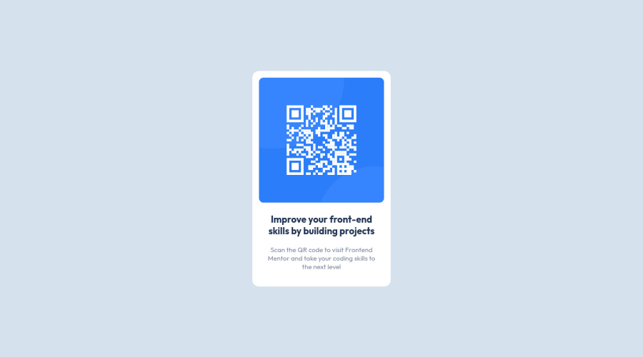
Design comparison
Community feedback
- @romila2003Posted over 2 years ago
Hi Veronica,
Welcome to the frontend mentor community and congratulations 🎉 for completing this challenge, it was a great attempt. The card looks great however there are some issues I want to address.
- For accessibility purposes, it would be best practice to wrap your main code within the
maintag which would ensure that your content is wrapped within the correct landmarks e.g.<main class="container"></main> - It is important to add the
altattribute within theimgtag e.g.<img class="img" alt=""> - I would suggest to give the body the flexbox property and give it the
heightof100vhe.g.
body {
  display: flex;
  align-items: center;
  justify-content: center;
  min-height: 100vh;
  background-color: var(--neutral-color-100);
}
Overall, great attempt and wish you the best for your future projects so keep coding 👍.
Marked as helpful0@veronisabPosted over 2 years ago@romila2003
Hi! Thank you so much for your feedback, I really appreciate it!
I wasn't aware that you are able to add a class to <main>, that is really a great help to know.
1 - For accessibility purposes, it would be best practice to wrap your main code within the
Please log in to post a comment
Log in with GitHubJoin our Discord community
Join thousands of Frontend Mentor community members taking the challenges, sharing resources, helping each other, and chatting about all things front-end!
Join our Discord
