Design comparison
SolutionDesign
Please log in to post a comment
Log in with GitHubCommunity feedback
- @hunterhuni
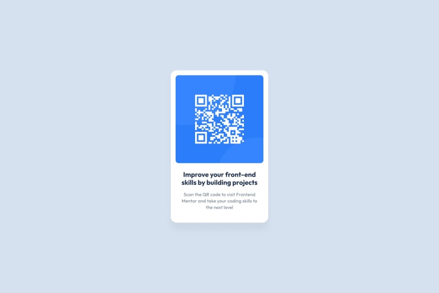
Your solution seems pretty good. But if you look closely on the design there's an additional padding for the texts both on the left and the right sides. While there's also a bigger padding on the bottom of the card in the original design.
Your font color is also slightly off.
Other than these great job! Keep up the good work!
Join our Discord community
Join thousands of Frontend Mentor community members taking the challenges, sharing resources, helping each other, and chatting about all things front-end!
Join our Discord
