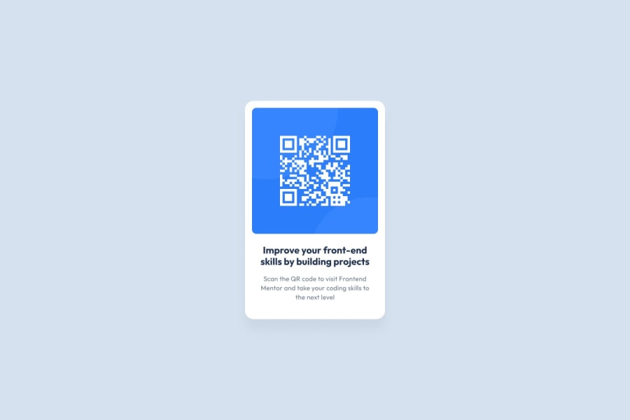
Design comparison
SolutionDesign
Solution retrospective
FEEDBACKS are welcome.
Community feedback
- @LolaMurePosted over 2 years ago
Hi! I just finished this challenge and I have some tips you may find helpful:
First, talking about the colors, I had some trouble assigning them too, so maybe this guideline may help you with making your solution more alike to the design:
- Background color of the page: hsl(212, 45%, 89%)
- Background color of the card: hsl(0,0%,100%)
- Color of the title: hsl(218, 44%, 22%)
- Color of the subtitle: hsl(220, 15%, 55%)
The other improvement to make your design more alike could be the font-family of the text. You should import it and use it like this:
On the HTML header:
- <link rel="preconnect" href="https://fonts.googleapis.com">
- <link rel="preconnect" href="https://fonts.gstatic.com" crossorigin>
- <link href="https://fonts.googleapis.com/css2 family=Outfit:wght@400;700&display=swap" rel="stylesheet">
On the CSS style:
- font-family: 'Outfit', sans-serif;
Hope you find it useful,
Send you kind regards and good luck with your journey!
1
Please log in to post a comment
Log in with GitHubJoin our Discord community
Join thousands of Frontend Mentor community members taking the challenges, sharing resources, helping each other, and chatting about all things front-end!
Join our Discord
