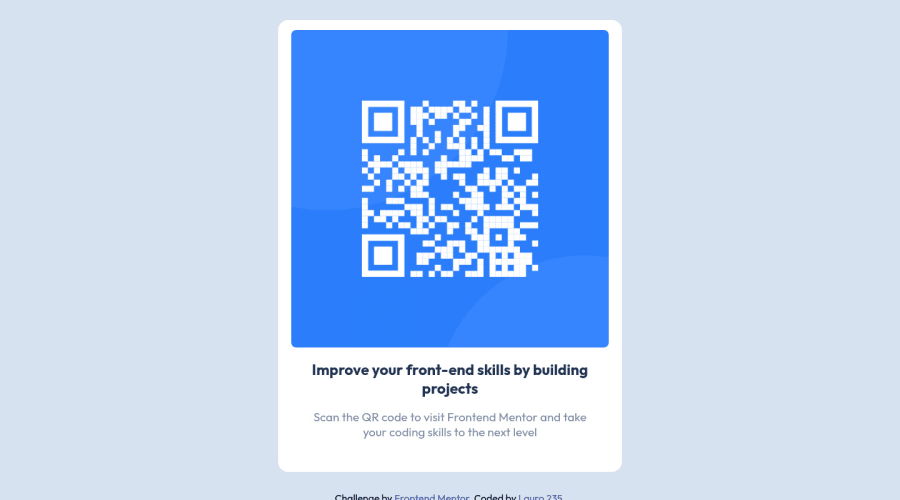
Design comparison
Solution retrospective
This was a quick one. Now that I know how to use git version control, I feel much better about contributing more projects. I'm curious how much improvement the project needs, accessibility wise.
Any constructive feedback is very welcome.
Thanks for checking this out.
Community feedback
- @Lauro235Posted over 2 years ago
@vanzasetia
Good spot on the alt text and I will come back to centering the container properly. Good idea to use flex!
I think rem is great, but I wouldn't say it's dynamic. It's a fixed value that is set in the root. I don't think em is dynamic either, it only resizes relative to the font size of it's parent. In this context I was happy with pixels.
Thanks for the comment about the width, but did you know you can refactor width: 100%; max-width: 600px; into one line?
In this project I used width: min(100%, 600px);
The first value sets the width it should be ideally at a minimum and the second value sets the maximum width.
I do appreciate your feedback, thanks.
0 - @vanzasetiaPosted over 2 years ago
Greetings, Lorentz! 👋
Congratulations on finishing this challenge! 🎉
It's great that you're thinking about accessibility. I have some feedback on this solution:
- Accessibility
- Good job on using
main
andfooter
landmarks correctly! 👍 - The QR code should have an alternative text like QR code. It's the most important content of the page.
- Good job on using
h1
! 👍 - Good job on using
rem
unit! 👍 - For the
boder-radius
, you should also userem
unit. That way, when the user scales the page,border-radius
will also get scaled. Personally, I useem
unit forborder-radius
. 🙂
- Good job on using
- Styling
- I would recommend making the
main
element as the card element and addingmax-width
to it. Currently, the card is bigger than the design. - If you follow what I recommend, then to make the card perfectly in the middle of the page, you can make the
body
element as a flexbox container.
- I would recommend making the
/** * 1. Make the card vertically center and * allow the body element to grow if needed */ body { display: flex; align-items: center; justify-content: center; min-height: 100vh; /* 1 */ }
That's it! Hopefully, this is helpful and happy coding! 😁
0 - Accessibility
Please log in to post a comment
Log in with GitHubJoin our Discord community
Join thousands of Frontend Mentor community members taking the challenges, sharing resources, helping each other, and chatting about all things front-end!
Join our Discord