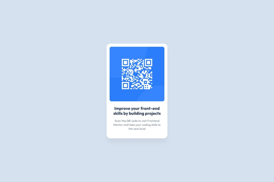
Design comparison
Solution retrospective
I am proud of how the rounded edges and padding look, and figuring out how to disable dragging the image makes the component feel a lot more professional. One thing I may do differently is use two different fonts; one for the titles, and another for the text.
What challenges did you encounter, and how did you overcome them?One major challenge I had was getting the text to stay within the card component. The text wanted to stretch the card out as much as possible, and my solution is to add a fixed width to both the header and paragraph elements. This solution works for this component, but may not be reusable because the paragraph and header width would have to be edited if the size of the image has to be changed.
What specific areas of your project would you like help with?I would like help removing the fixed width to the paragraph and header elements, and making the width of the card depend on the width of the image. Ways to reduce the number of styling classes I have would also be appreciated!
Community feedback
- @modjiPosted 5 months ago
Overall a great example on how to use tailwind-css. There's many ways to do it and your is very clean. Any reasons as to why a use of h3 instead of h1?
1@BrianHammerPosted 5 months ago@modji Thank you. I figured that there would be other headers that are larger used elsewhere in the application since this is a card, and that's why I put it as an h3. h1 works perfectly fine as well.
0
Please log in to post a comment
Log in with GitHubJoin our Discord community
Join thousands of Frontend Mentor community members taking the challenges, sharing resources, helping each other, and chatting about all things front-end!
Join our Discord
