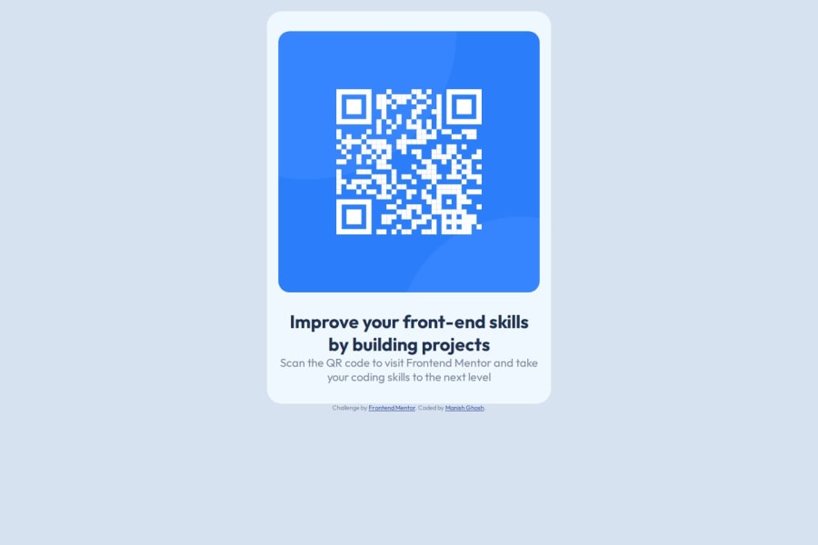
Design comparison
Solution retrospective
"I’m most proud of the clean and minimalistic design I was able to achieve with this project. The layout effectively highlights the QR code, which is the focal point, and the text complements it well without being overwhelming."If I were to do this project again, I would focus on enhancing accessibility and improving performance. For instance, I would add more descriptive alt text to the QR code image to make it more accessible to screen readers.
What challenges did you encounter, and how did you overcome them?"One of the challenges I encountered was ensuring that the design remained responsive and visually appealing across various screen sizes. Initially, the layout looked great on smaller screens, but it appeared too narrow and awkward on larger displays.To overcome this, I experimented with different width percentages and media queries. By adjusting the container's width and font sizes based on the screen size, I was able to create a layout that looks good on both small and large screens.
What specific areas of your project would you like help with?Responsiveness: Although I implemented media queries to adjust the layout for different screen sizes, I’m still not entirely confident that the design is fully optimized for all devices, especially very large screens or tablets in landscape mode. I would appreciate feedback on how to further improve responsiveness and make the layout more adaptable.
Accessibility: I’ve included basic alt text for images and ensured color contrast, but I’m aware that accessibility involves much more. I’d like advice on additional best practices for making the component more accessible to users with disabilities, such as keyboard navigation or screen reader compatibility.
Community feedback
- P@MikDra1Posted 8 months ago
To make your card truly responsive I advice you to use this technique:
.card { width: min(600px, 90%) }
This ensures that the card won’t get bigger then 600px but on smaller screens it will be 90% of the viewport . The min() functions takes the smaller number.
It is the same as:
.card { width: 90%; max-width: 600px; }
Hope you found this comment helpful ❤️
Good job and keep going 😁😃😉
0 - @sayv-xoPosted 8 months ago
great job. however, you need to fix the responsive design. consider using media queries.
0 - @salva-itPosted 8 months ago
Congratulations on your effort to complete this challenge
Feedback on any progress
For better organization it is better to move the css files to an external style sheet
You used the family font in the style, but you forgot to call the Google font link in the <head> of the site
There is a typo in the <h4> style changeheight:6pc; to px Of course, it is suggested to use rem variable unit to improve acceptability and responsive design
Use semantic HTML tags such as <header>, <main> and <footer> to improve SEO and code organization.
By using the Inspect tool for responsive design, you can identify issues that exist on different devices and do better.
good luck
0
Please log in to post a comment
Log in with GitHubJoin our Discord community
Join thousands of Frontend Mentor community members taking the challenges, sharing resources, helping each other, and chatting about all things front-end!
Join our Discord
