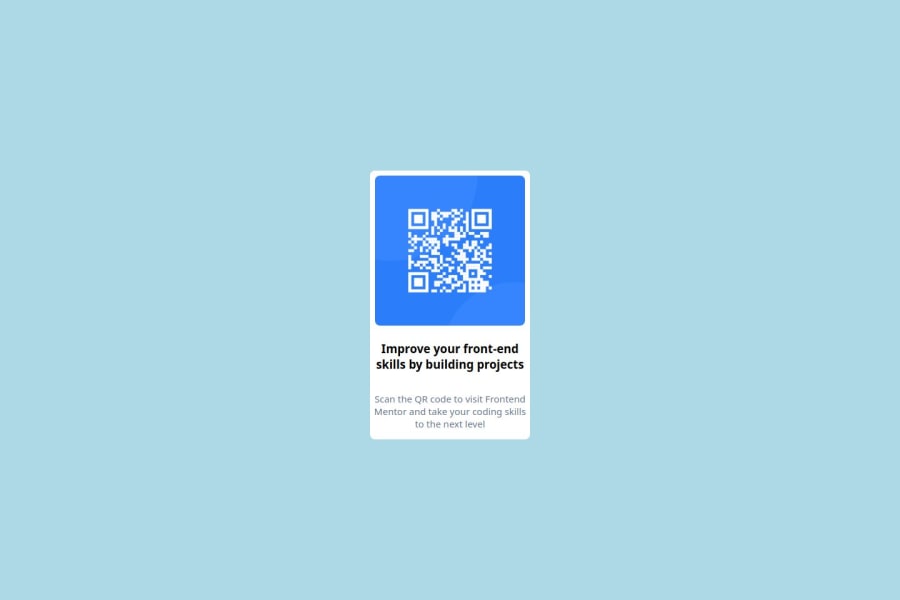
Design comparison
Solution retrospective
I was able to remember most of the css styles that I have to use to make the look like the design. I would like to add more options and make the site more responsive if I get a chance to do it again.
What challenges did you encounter, and how did you overcome them?Making the QR Scanner responsive based on page height and width is challenge that I loved and learned.
- I tired multiple options and observed how it is effecting the live page.
- Incorporated the necessary changes from what I have learned.
I would like to have someone review and guide me more on
- Responsiveness using vh,vw
- media queries
- margin and padding while dealing with responsive design
Community feedback
- @Shrinath13Posted 6 months ago
I think you have done good job, the only thing that was missing was font outfit is missing but overall its good.
Marked as helpful0
Please log in to post a comment
Log in with GitHubJoin our Discord community
Join thousands of Frontend Mentor community members taking the challenges, sharing resources, helping each other, and chatting about all things front-end!
Join our Discord
