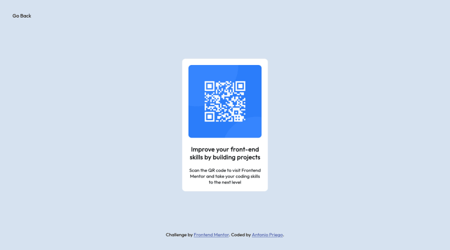
QR Scanner Layout (Desktop / Mobile) using HTML5 & CSS3
Design comparison
Solution retrospective
- In small / general projects like this, is there a difference between using Grid or FlexBox to center the DIV?
Community feedback
- @joeterleckiPosted over 1 year ago
Good job so far!! As for some things to workon:
Now that you have the layout complete, try and get your aspect ratio correct. Try to get the card to close as possible to the original.
For your question, and in my opinion, along with some frontend developers I work with, use the grid for your larger layout of a full page and for complicated components; however, use a flex box for alignment.
Flexbox and grid are not used as either but used together to achieve a desired layout.
For simple cards, flexbox is probably suited best because you are only aligning a few text elements and maybe an image and icon.
Marked as helpful0 - @Finney06Posted over 1 year ago
HTML 🏷️:
To clear the Accessibility report:
-
Wrap the page's whole main content in the
<main>tag. -
Use HTML5 semantic elements such as
<header>,<nav>,<main>,<aside>, and<footer>to define these sections.
Here is a web accessibility evaluation tool📕 to check your webpage for any remaining errors or warnings related to landmarks.
I hope you find it helpful!😏 Above all, the solution you submitted is 👌. 🎉Happy coding!
0 -
Please log in to post a comment
Log in with GitHubJoin our Discord community
Join thousands of Frontend Mentor community members taking the challenges, sharing resources, helping each other, and chatting about all things front-end!
Join our Discord
