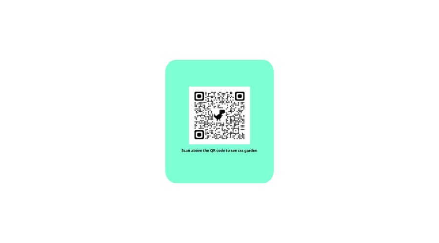
Design comparison
Solution retrospective
This is my first time doing this, I have been teaching myself code for a couple months now. I watched lots of tutorials, read articles and even used platforms like codecademy and coddy. However, I realized that despite learning css and html properties , I did not know how to utilize what I have learnt to build something. So I decided to make my learning more practical, less theory. I downloaded visual studio code and followed this challenge instructions step by step. If I did not know why something was not working or how to fix errors I asked chat gpt to tell me what I was doing wrong and how to improve. When I was reading about css and html there were some confusing things , but think I understand flexbox and div containers better now that I practiced this challenge .
My key insight is this: you want to get learn code and get better at it then simply open visual studio code or whatever platform you are familiar went , get a prompt , sketch the visuals you want it to have , then try to bring that to life. As you try out stuff, research , ask ai , watch relevant tutorials on specific problems you encounter (instead of cramming information you have no idea what to do with ) share with people for insight and just be on your computer/laptop as much as you can. In short: Code to learn code.
Community feedback
Please log in to post a comment
Log in with GitHubJoin our Discord community
Join thousands of Frontend Mentor community members taking the challenges, sharing resources, helping each other, and chatting about all things front-end!
Join our Discord
