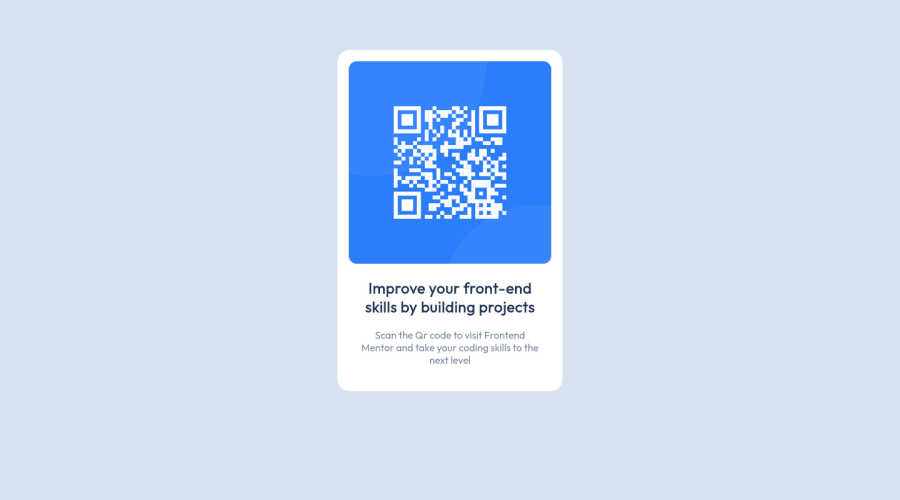
QR scan page using semantic HTML5 markup and CSS properties
Design comparison
Solution retrospective
I could not use flex box in my project because I do not really understand it. Does anyone have recommendations of where I can learn flexbox from?
Community feedback
- @correlucasPosted about 2 years ago
๐พHi @Teke111, congratulations on your solution!๐ Welcome to the Frontend Mentor Coding Community!
Great solution and a great start! From what I saw youโre on the right track. Iโve few suggestions for you that you can consider adding to your code:
1.Replace the
<h2>
containing the main title with<h1>
note that this title is the main heading for this page and every page needs one h1 to show which is the most important heading. Use the sequence h1 h2 h3 h4 h5 to show the hierarchy of your titles in the level of importance, never jump a level.2.Clean your code by removing some unnecessary divs, most of the content can stand alone without a div. Use div only for blocks that need a special alignment or the content needs a special positioning.
3.Add
<main>
instead of<div>
to wrap the card container. This way you show that this is the main block of content and also replace the div with a semantic tag.4.Use relative units like
rem or em
instead ofpx
to have a better performance when your page content resizes on different screens and devices.REM
andEM
does not just apply to font size, but all sizes as well. To save your time you can code your whole page usingpx
and then in the end use a VsCode plugin calledpx to rem
to do the automatic conversion or use this website https://pixelsconverter.com/px-to-remHere's my solution for this challenge if you wants to see how I build it: https://www.frontendmentor.io/solutions/qr-code-component-vanilla-cs-js-darklight-mode-nS2aOYYsJR
โ๏ธ I hope this helps you and happy coding!
Marked as helpful0@Teke111Posted about 2 years ago@correlucas Thank you very much for your tips. I will work on it
0 - @AK-CHP1Posted about 2 years ago
Congratulations on completing this project
I think you can further improve your project by using media queries to change layout for mobile devices (
max-width: 375px
as per the style guide)Also you can learn the basics of flexbox at:
- MDN here
- Wes Bos's free course at flexbox.io
Please consider checking my solution here and provide some feedback.
Please let me know it that helped.
Thanks
0@Teke111Posted about 2 years ago@AK-CHP1 Thank you for the observation. I will add media query to it
0
Please log in to post a comment
Log in with GitHubJoin our Discord community
Join thousands of Frontend Mentor community members taking the challenges, sharing resources, helping each other, and chatting about all things front-end!
Join our Discord