Design comparison
Community feedback
- @sofiasmnkPosted about 1 month ago
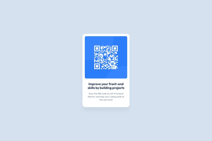
It looks almost exactly like the design, I think the only difference I see is that the text is missing the additional padding on the sides (while the image only has 16px of padding on the left and right, the text is supposed to have 32px).
The CSS is giving things fixed sizes where it's not necessary. For an instance, the height of the card doesn't need to be explicitly set to
height: 499px, if you just set the width and padding correctly you'll see that just letting the card's height adjust to the content will result in the same height.It's also redundant to be setting both the card width and image width in pixels; usually you'll want to either set the width of the card and let the image scale to fill it, or set the width on the image and let the card size itself it fit around it.
Marked as helpful0
Please log in to post a comment
Log in with GitHubJoin our Discord community
Join thousands of Frontend Mentor community members taking the challenges, sharing resources, helping each other, and chatting about all things front-end!
Join our Discord
