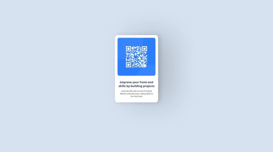
Design comparison
SolutionDesign
Solution retrospective
What are you most proud of, and what would you do differently next time?
well i was proud of me centering a div, and figuring out how to do stuff
maybe i will improve on the responsive next time!
What challenges did you encounter, and how did you overcome them?it was making the container small and centered. i used a flex for this and it did not help. it didn't shrink the thing.
but i made the image smaller and then change the contained to inline block. i wrapped up that element in another div which have flex to make it centered horizontally. i used the translate to center it vertically since align items didn't worked so i then did it.
also deploying the page was a huge mess! but i figured it out.
What specific areas of your project would you like help with?for now, nothing
Community feedback
Please log in to post a comment
Log in with GitHubJoin our Discord community
Join thousands of Frontend Mentor community members taking the challenges, sharing resources, helping each other, and chatting about all things front-end!
Join our Discord
