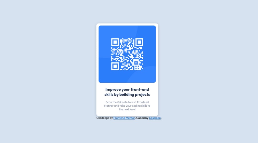
Design comparison
Solution retrospective
I still need to practice a lot flex-box, and have the sizes adjust automatically depending on the available space. Any comments, tips or better ways to do it would be much appreciated (with explanation included haha).
Community feedback
- @Devon107Posted over 1 year ago
Your solution looks good. Here some tips:
Avoid using div tags for a better accesibility, in HTML 5 you can use:
- section as your container
- figure for images container or picture if you will use different sizes for each device. Put the <div class"attribution" . . . as footer, use footer tag instead div and put it below the main tag.
Marked as helpful1 - @NADS-PROGRAMMERPosted over 1 year ago
Congratulations on completing this challenge.
Here are my few suggestions:
-
I saw that you have an accessibility report. It says that you should have at least 1 heading on your page.
-
I review your CSS file code and noticed that you are using absolute units like
px
. As a good practice, try to avoid using it because it can lead to unresponsive design. Try to search relative units such asrem
,em
,vh
,vw
etc. -
In the design, add a little bit more padding to the card itself to become more match to the actual design.
That's it. I hope it helps. Happy coding!
Marked as helpful1 -
- @0xabdulkhaliqPosted over 1 year ago
Hello there 👋. Congratulations on successfully completing the challenge! 🎉
- I have other recommendations regarding your code that I believe will be of great interest to you.
.
HEADINGS ⚠️:
- This solution has generated accessibility error report due to lack of level-one heading
<h1>
- Every site must want at least one
h1
element identifying and describing the main content of the page.
- An
h1
heading provides an important navigation point for users of assistive technologies, allowing them to easily find the main content of the page.
- So we want to add a level-one heading to improve accessibility by reading aloud the heading by screen readers, you can achieve this by adding a
sr-only
class to hide it from visual users (it will be useful for visually impaired users)
.
I hope you find this helpful 😄 Above all, the solution you submitted is great !
Happy coding!
1
Please log in to post a comment
Log in with GitHubJoin our Discord community
Join thousands of Frontend Mentor community members taking the challenges, sharing resources, helping each other, and chatting about all things front-end!
Join our Discord