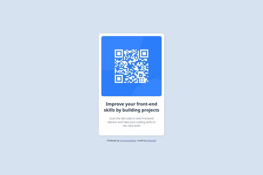
Design comparison
Solution retrospective
I am proud of how quick i managed to make the main design !
What challenges did you encounter, and how did you overcome them?I had to center the text and image using margins at first,which i found difficult but after a quick research i used flex instead !
What specific areas of your project would you like help with?when to align the items and how to center elements,which selectors to rely on and wich to AVOID!
Community feedback
- @salehjosephPosted 6 months ago
You forgot to change the color of the text "Scan the QR code to visit Frontend Mentor and take your coding skills to the next level." but everything is beautiful
Marked as helpful0 - P@DannyGuerinPosted 6 months ago
Hey Sim, it's looking good. Here's a few quick things I noticed:
- I'm unsure if it's my screen, but does the background color look a little different to the design?
- The size of your card is smaller than the design.
- Be sure to check the font colors for your text, as they look a little darker than the design.
Marked as helpful0@Simsim99Posted 6 months ago@DannyGuerin You are right. Fixed the background color and the color of the text, as well as the card size, it was indeed smaller but i made it even bigger this time . Thank you for the feedback!
0
Please log in to post a comment
Log in with GitHubJoin our Discord community
Join thousands of Frontend Mentor community members taking the challenges, sharing resources, helping each other, and chatting about all things front-end!
Join our Discord
