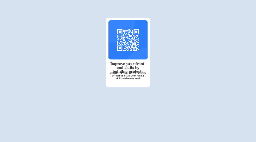
Design comparison
Solution retrospective
First challenge. A good practice to cement down concepts I learned these past days
Had a hard time: -Positioning the divs where I wanted to: vertical and horizontal centering. -Playing around with the pixels to make it look like I wanted it to
-Is there a better/easier way to position the divs?
I'm not sure about the excessive use of classes. For this small challenge is easy because there are so few elements.. I'd appreciate any advice so I get use to best practices and avoid issues with larger projects/challenges.
Community feedback
- @MelvinAguilarPosted about 2 years ago
Hi @jesuswrivas ๐, good job completing this challenge, and welcome to the Frontend Mentor Community! ๐
I have some suggestions you might consider to improve your code:
- Use the
<main>
tag to wrap all the main content in your solution instead of using<div class="border1">
.
- Try to use more descriptive names for your classes. I suggest you learn the BEM naming convention standard for CSS class names because increases the readability of front-end code and provides a modular structure. For example, the classes "border1" and "qrtext2" do not say what they are.
- Setting a defined
height
for the card component is not recommended. In addition, simply setting paragraph heights will lead to problems. The content should define the component height, otherwise, it will not be allowed to extend beyond your specifications. Alternatively, you can usemin-height
for the component.
- Instead of using pixels in font size, use relative units of measure like
rem
orem
. The font size in absolute length units (px) does not allow users with limited vision to change the text size in some browsers. Reference.
- The container isn't centered correctly. You can use flexbox or grid layout to center elements. You can read more about centering in CSS here.
Above all, the project is done well๐. I hope those tips will help you! ๐
Good job, and happy coding! ๐
Marked as helpful1@jesuswrivasPosted about 2 years agoHi @MelvinAguilar, thank you for your time!
This was a beautiful and well explained feedback. These tips will definitely help me! Thank you for your time and kindness.
1@MelvinAguilarPosted about 2 years ago@jesuswrivas Youโre welcome! ๐
0 - Use the
Please log in to post a comment
Log in with GitHubJoin our Discord community
Join thousands of Frontend Mentor community members taking the challenges, sharing resources, helping each other, and chatting about all things front-end!
Join our Discord