Not Found
Not Found
Not Found
Not Found
Not Found
Not Found
Not Found
Not Found
Not Found
Not Found
Not Found
Not Found
Not Found
Not Found
Not Found
Not Found
Not Found
Not Found
Not Found
Not Found

Submitted

QR Landing page using Flex & Media Queries

PJ 110

@Kitezh1

Desktop design screenshot for the QR code component coding challenge

This is a solution for...

  • HTML
  • CSS
1newbie
View challenge

Design comparison


SolutionDesign

Solution retrospective


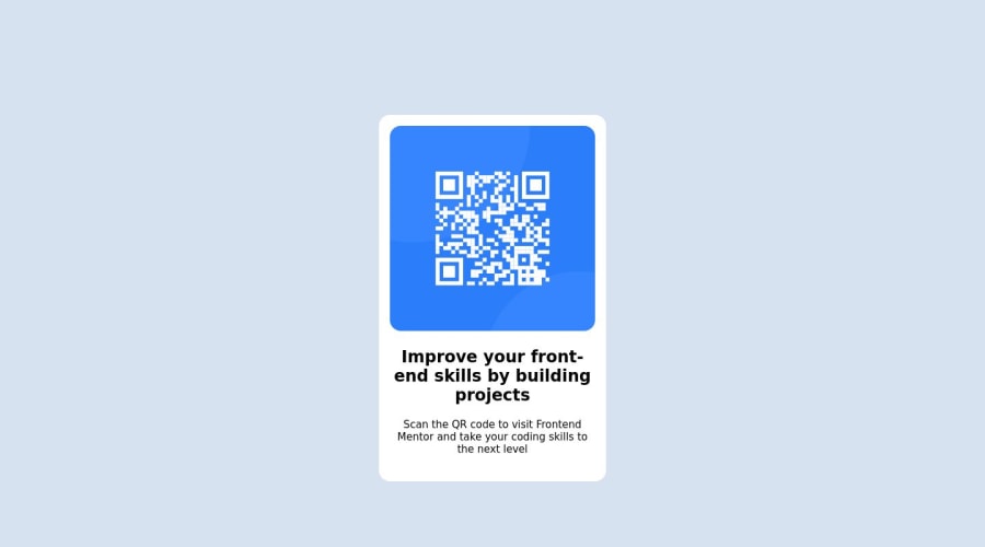
I found getting the section exactly in the middle of the page and having it scale. I'm not sure of my padding and media use, and if flex was the right option. Would love feedback please.

Community feedback

@iberberoglu

Posted

Hey PJ 👋 I've just reviewed your code and noticed that you centered the section using 'padding', but it creates scrolling on screens with larger heights. If you want it to stay fixed in the middle of the screen without create scrolling; instead of using padding: 10em; on the body element, try using :

height: 100vh;
margin: 0;

and use align-items: center; with flex to center the section perfectly. Give this solution a try! Additionally, if you're not familiar with 'vh', I recommend checking out a few links I'll provide you to learn more about it.

Apart from that, great job on the code!

Marked as helpful

1

PJ 110

@Kitezh1

Posted

Thank you İsmail! This was really helpful, going to give vh a look. @iberberoglu

0
Tushar Biswas 4,080

@itush

Posted

Congratulations on completing the challenge! 🎉

Welcome to the platform! 🎉 We're thrilled to have you here and excited to see your progress 💪as you continue your front-end development journey.

  • Your solution looks nice to me :)

  • Using flexbox is not incorrect to center it.

In my projects:

  • I always start with mobile-first workflow.
  • I use at least one main element for a page (entire content goes into the main, if I'm not using header & footer), and avoid divs as much as possible and use section and article element wherever I can.
<body>
<main>
All content 
</main>
</body>
  • I Use relative units as much as possible and avoid absolute units whenever possible.

  • I remember when I started out, I made countless mistakes and spent long hours searching for solutions. But hey, you don't need to go through the same struggles! 🙌 To help you shorten the learning curve, I recommend going through the following articles. They contain valuable insights that can make your journey smoother:

📚🔍 12 important CSS topics where I discuss about css position, z-index, box-model, flexbox, grid, media queries, mobile-first workflow, best practices etc. in a simple way.

📚🔍 11 important HTML topics where I discuss about my thought process and approach to convert a design/mock-up to HTML along with other topics.

I hope you find these resources helpful in your coding adventures! 🤞

I'm eagerly looking forward to seeing the amazing projects you'll create in the future! 🚀💻

Keep up the fantastic work and happy hacking! 💪✨

Marked as helpful

1

Please log in to post a comment

Log in with GitHub
Discord logo

Join our Discord community

Join thousands of Frontend Mentor community members taking the challenges, sharing resources, helping each other, and chatting about all things front-end!

Join our Discord