Not Found
Not Found
Not Found
Not Found
Not Found
Not Found
Not Found
Not Found
Not Found
Not Found
Not Found
Not Found
Not Found
Not Found
Not Found
Not Found
Not Found
Not Found
Not Found
Not Found

Submitted

QR Generator Light, Dark and Pink Themes - React & Styled Components

David 8,000

@DavidMorgade

Desktop design screenshot for the QR code component coding challenge

This is a solution for...

  • HTML
  • CSS
1newbie
View challenge

Design comparison


SolutionDesign

Solution retrospective


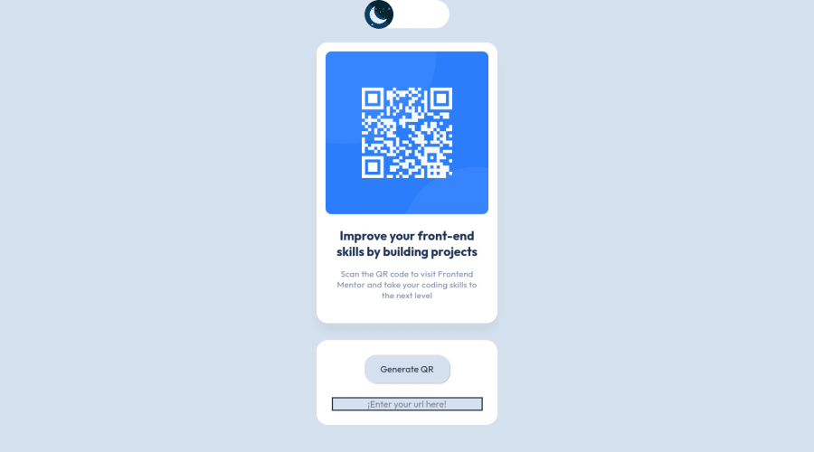
Hello and welcome to my QR Component solution

This was quite funny to build, first of all, I got a bit of a burnout with other challenge that I can't manage to finish, so I came to the idea of finishing this one but with a bit of my own style, I wan't to give some credits to @denielden and @correlucas because their solutions to this little challenge gave me a lot of ideas!

Extra Features

  • 3 custom themes, Dark, Light and Pink themes.
  • The first theme that you will get on load will be your OS/Browser theme.
  • Theme gets saved on reload!
  • Add your own url and generate your own QR code !

Built with:

  • React
  • Styled Components / Theming with Styled Components
  • goqr API

Hope you like it!, any feedback would be appreciate, I would apply all the changes that you suggest me here!

Community feedback

Elaine 11,400

@elaineleung

Posted

Hi David, I know what you mean by burnout and I actually briefly considered doing this same project for the same reason 😂

I really like how you combined both Deniel and Lucas's ideas and came up with this! I guess the only comment/question I have is, I tried choosing a theme on the switcher, and it looks like instead of being able to do that by clicking on the theme, the switch kind of cycles through in the same direction with each click. Is that a choice you made in the design where the user can't choose the theme directly and needs to wait for the theme to cycle through? Btw, I'm currently building the calculator app which also has 3 themes; I used radio buttons in my switcher, and it's interesting to see another approach here with just a button.

That's all I got, hope to see more! 😊

Marked as helpful

3

David 8,000

@DavidMorgade

Posted

@elaineleung Hello Elaine, is a pleasure to have you in my comments section!

Regarding the burnout... I'm with the tic-tac-toe challenge, trying to guess the CPU part of the game, I already did the PvP and the full layout (mobile, tablet and desktop), but I have been stuck on this for 3 days and I think that having a break on that project is the best choice to keep forward!

The theme switcher just came out of nowhere in my mind, first of all this project was only going to be a light / dark and thats it, then I started adding things randomly from both of those projects ideas and this came up, probably going to change that button soon, added it this way cause it was the only way I could get it animated, but maybe a draggable button could be the best option. Gonna try the radio buttons later but I think it will be harder to get them on an animation.

Thanks for your comment and feedback! really appreciate it!

1
Elaine 11,400

@elaineleung

Posted

@DavidMorgade Oh wow, I only realized now what the animation means, as I didn't really get it at first 😅. It's really cute though!

Good luck with the Tic-Tac-Toe, looking forward to it 🙂

1

@dostonnabotov

Posted

Hi, there! That looks great! But, I found some problems, too. First, in the 3rd (pink) theme, the color contrast of the body paragraph is very low and fails the a11y test. Consider changing its color to ensure it is accessible for all users.

Also, in the 2nd (dark) theme, the QR code is dark-colored as well as the card and body itself, which makes it harder to see the QR code properly. Changing the color of the QR code or adding background color would be a good solution, I think.

Last, but not least, it might not be a big issue, but the input style is quite weird. If you look at the site, you see cool, bordered styles, and suddenly input appears, looking sharp-edged and standing out from the rest of the group. Adding a little bit of styling would make it look much better.

I hope it helps! Good luck!

Marked as helpful

0

David 8,000

@DavidMorgade

Posted

@dostonnabotov Hey Doston thanks you for the feedback!

  • Yeah I just used a random Pallete for the pink style gonna change it soon when this project gets updated!

  • Thats actually a thing that I didn't notice when I did this, also gotta change it when I update the project!

  • Do you mean the input type='text', dunno man I think it looks quite simple like this, the component itself is simple and I don't think it needs that much of styles, maybe a bit of border-radius?

0
Lucas 👾 104,420

@correlucas

Posted

The best solution for this challenge @davidmorgade 👏

I liked a lots the second style 🐰

1
Naleeka 470

@Naleeka

Posted

mannn ,this is cool <3

1

Please log in to post a comment

Log in with GitHub
Discord logo

Join our Discord community

Join thousands of Frontend Mentor community members taking the challenges, sharing resources, helping each other, and chatting about all things front-end!

Join our Discord