

Design comparison

Solution retrospective
I’m proud that, despite it being my first time tackling a challenge like this, I managed to get started and successfully build the project using vanilla CSS. It felt rewarding to dive back into CSS after a long break from coding with it.
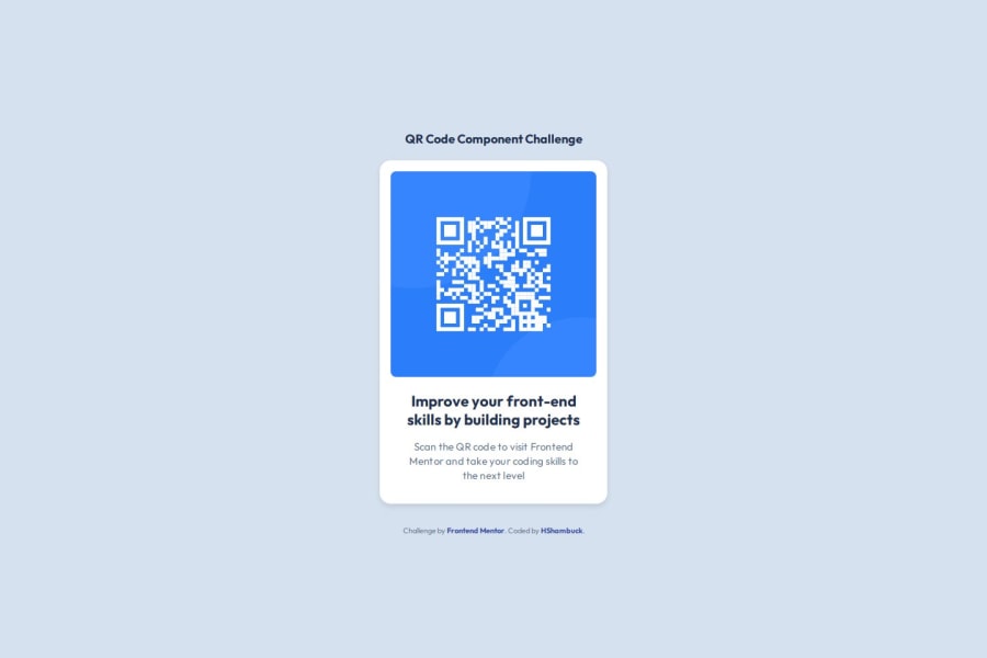
What challenges did you encounter, and how did you overcome them?When I started this challenge, I faced an issue identifying the main outline or div within the body. The problem stemmed from the image in the top layer of the parent div being too large. To troubleshoot the layout, I temporarily applied a red background to the parent div. To my surprise, it only highlighted the second layer (the QR details), leaving me confused. After some thought, I realized the issue was with the image size. Setting the image width to 100% resolved the problem perfectly.
The biggest challenge, however, was centering—particularly vertical centering. For horizontal centering, I initially used margin: auto, which worked well. But for vertical centering, I tried using align-items and couldn’t figure out why it wasn’t working. After several attempts, I discovered the problem: I was applying align-items to the child div instead of the parent div, which had the display: flex property. Once I applied align-items to the correct parent div, it worked perfectly. Additionally, I replaced margin: auto with justify-content for horizontal centering, achieving consistent and clean results.
Community feedback
Please log in to post a comment
Log in with GitHubJoin our Discord community
Join thousands of Frontend Mentor community members taking the challenges, sharing resources, helping each other, and chatting about all things front-end!
Join our Discord