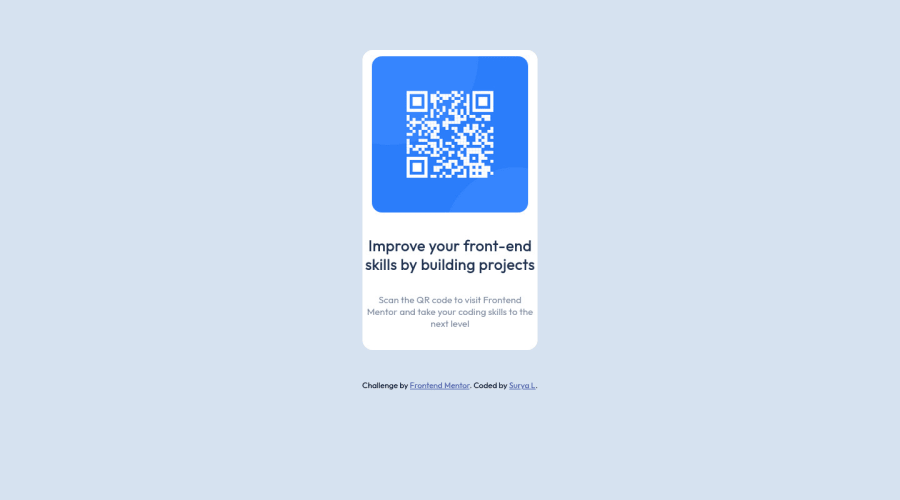
Design comparison
Community feedback
- @funficientPosted over 2 years ago
Hey @Surya8991, congratulations on submitting your first challenge!
You can get rid of the accessibility warnings in the report above by adding a <main> and <footer> section to your html.
You can also center your content by removing the set margins and adding the grid center properties and height to the body, like:
{
background-color: hsl(212, 45%, 89%);
font-family: 'Outfit', sans-serif;
text-align: center;
display: grid;
height: 100vh;
align-items: center;
justify-content: center;
}
Lastly, to make the H2 text more readable, I could suggest adding some padding. Other than that, it looks great!
Well done! Hope this feedback is useful to you. I'm learning by trying to teach ;-).
Happy hacking!
Marked as helpful0
Please log in to post a comment
Log in with GitHubJoin our Discord community
Join thousands of Frontend Mentor community members taking the challenges, sharing resources, helping each other, and chatting about all things front-end!
Join our Discord
