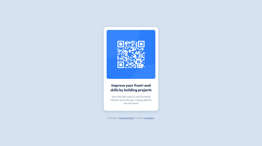
Design comparison
Solution retrospective
Is use of flexbox here looking ok? Or could i have arranged flex elements in a better / more succinct way?
Thanks in advance for any help and advice!
Community feedback
- @denieldenPosted almost 3 years ago
Hi HutHut, great job!
Remove all
margin
fromqr-code-component
because with flex they are superfluous, for center the card addalign-items: center
to body. Read here -> flex guideOverall you did well! Hope this help ;)
Marked as helpful0@j-hutchisonPosted almost 3 years ago@denielden cheers deniel! I knew there was something didn't feel quite right about that margin 😅 will take a look later!
Thank you for reviewing for me!
1@denieldenPosted almost 3 years ago@j-hutchison You are welcome! And don't forget to mark my comment as helpful :) thanks
0 - @NaveenGumastePosted almost 3 years ago
Hay ! HutHut Good Job on challenge
These below mentioned tricks will help you remove any Accessibility Issues
-> Add Main tag after body
<main class="container"></main>
-> Always use h1 first and then h2, h3 and so on
-> Learn more on accessibility issues
If this comment helps you then pls mark it as helpful!
Have a good day and keep coding 👍!
0
Please log in to post a comment
Log in with GitHubJoin our Discord community
Join thousands of Frontend Mentor community members taking the challenges, sharing resources, helping each other, and chatting about all things front-end!
Join our Discord