Not Found
Not Found
Not Found
Not Found
Not Found
Not Found
Not Found
Not Found
Not Found
Not Found
Not Found
Not Found
Not Found
Not Found
Not Found
Not Found
Not Found
Not Found
Not Found
Not Found

Submitted

QR Component Vanilla HTML/CSS

P

@joeterlecki

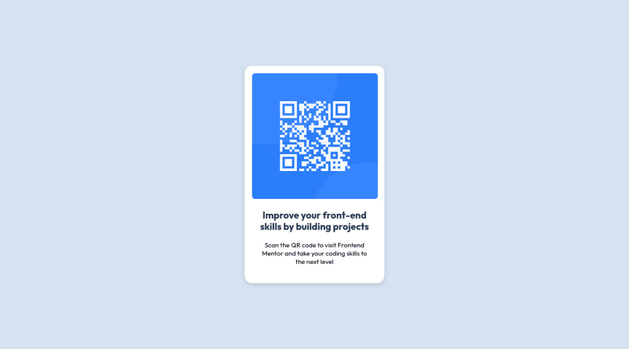
Desktop design screenshot for the QR code component coding challenge

This is a solution for...

  • HTML
  • CSS
1newbie
View challenge

Design comparison


SolutionDesign

Solution retrospective


I have been learning web development off and on for 6 months and starting to get back into it. Please tell me how I did my first time getting back into HTML and CSS.

Is there anything that stands out that doesn't belong? I tried to get the image exactly as defined and then looked at the Figma files. I think I got it pretty close.

Community feedback

Josh 1,070

@josh76543210

Posted

Great job on your solution! Looks Good!

Here are some recommendations for improving your code:

HTML: Use semantic elements such as <main> and <footer> to improve the accessibility and organization of your page.

Alt text: Images must have alternate text. For example: <img src="images/image-qr-code.png" alt="QR code to frontendmentor.io"/>

CSS: Use relative units like em or rem for the font-size instead of using pixels. The font-size in absolute units like pixels does not scale with the user's browser settings.

I hope you find these useful!

Happy coding!

Marked as helpful

1

P

@joeterlecki

Posted

@josh76543210 Thanks for the feedback. I'm aware of the semantic elements but thought they were overkill for a component like this.

I guess maybe it makes sense to use <header> for the card header.

Good call on the ALT text, I forgot about that.

DO you have a preference to em vs rem? I feel like rem is the better choice based on videos and documentation I have read but I do not have the real word experience to back that up.

Thanks, a lot for your feedback. Ill make sure to incorporate it into my next project here.

0
Josh 1,070

@josh76543210

Posted

@joeterlecki There’s no better unit really, and it all depends on your personal preferences.

Some people like to design everything in rem units for consistency and predictability, while others like to also use em units in places where the influence of nearby parent elements would make sense.

Using rem units allows you to avoid the compounding effect of em units. With rem things are always and consistently based on the font-size of the root element.

That's why I personally prefer to use rem.

0
Abdessamad 210

@styrexx

Posted

Hello there 👋. You did a good job!

Congratulations on completing your first Frontend Mentor challenge! 🎉

There are a few changes you can make your solution better.

  • Wrap "Improve Your Front-End Skills By Building Projects" with an <h1> instead of <h2> element. Each page should have at one <h1>.

  • Fix the issues that have been reported.

  • To have a nice paragraph you can increase opacity.

I hope you find this helpful.

0

Please log in to post a comment

Log in with GitHub
Discord logo

Join our Discord community

Join thousands of Frontend Mentor community members taking the challenges, sharing resources, helping each other, and chatting about all things front-end!

Join our Discord