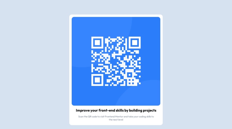
Design comparison
Solution retrospective
I don't think that my project really transfers very well to mobile. I wanted to make this component as simple as possible, so without getting into things like media queries, are there some ways that would help to create responsive designs?
Community feedback
- @imadvvPosted almost 2 years ago
Greeting Ross Porter!! Congratulations for completing your first challenge, 👏👏👏.
you did great job using flex, you can just use
max-widthinstead to fix width on the card, and also it's a good idea to usereminstead of percentage, something like so.card { max-width: 19rem; }Overall good attempt, keep it up, and have a good day/night
Marked as helpful1@porter-s-rossPosted almost 2 years agoThanks so much! I didn't think of using the fix-width, but that's a good tip. @imadbg01
1 - @0xabdulkhaliqPosted almost 2 years ago
Hello there 👋. Congratulations on successfully completing the challenge! 🎉
- I have other recommendations regarding your code that I believe will be of great interest to you.
HEADINGS ⚠️:
- This solution consists incorrect usage of
<h3>so it can cause severe accessibility errors due to incorrect usage of level-three headings<h3>
- Every site must want only one
h1element identifying and describing the main content of the page.
- An
h1heading provides an important navigation point for users of assistive technologies, allowing them to easily find the main content of the page.
- In this solution there's
<h3>element which is this<h3>Improve your...</h3>, you can preferably use<h1>instead of<h3>. Remember<h1>provides an important navigation point for users of assistive technologies so we want to use it wisely
- So we want to add a level-one heading to improve accessibility
- Example:
<h1>Improve your front-end skills by building projects</h1>
- If you have any questions or need further clarification, and feel free to reach out to me.
- If you have any questions or need further clarification, you can always check out
my submissionand/or feel free to reach out to me.
.
I hope you find this helpful 😄 Above all, the solution you submitted is great !
Happy coding!
0@porter-s-rossPosted almost 2 years ago@0xAbdulKhalid Thanks for point this out Abdul! I wasn't entirely aware of the importance of using at least one H1 element, so I appreciate your response. I will fix that and keep that in mind going forward.
0
Please log in to post a comment
Log in with GitHubJoin our Discord community
Join thousands of Frontend Mentor community members taking the challenges, sharing resources, helping each other, and chatting about all things front-end!
Join our Discord
