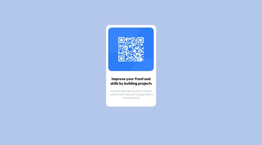
Design comparison
Solution retrospective
This will be my first project after learning some HTML and CSS. So its like the first step, I don't know if there is anything to be proud for exactly since this is a beginner project but I will say that it felt nice to make this.
Next time I will learn more things and try to make it with additional features.
Community feedback
- @DylandeBruijnPosted 4 months ago
Hi @mayank1405,
Congratulations on completing your first project, it's definitely something to be proud of, even if it's a beginner project. Everyone has to start somewhere, and CSS can be difficult to wrap your head around. I'm happy you had fun making this. It's great you are willing to learn more things and try to come up with additional features, keep that mindset going!
A bit of friendly constructive feedback:
-
I notice you use inline CSS styling and a separate stylesheet. Good job on linking the stylesheet, that is a good practice. I would suggest getting rid of the inline styling and moving that to your stylesheet. While inline styling has it's uses it's better to put all your styling in a separate file.
-
Try to use more descriptive and reusable CSS classes and ids. An id like
#white
communicates to me that it would give the element it's put on a white background or text color. You could style your QR code card using a class instead of an ID and name it.qr-code-card
for example. Then you could a class on the image inside the card and name it.qr-code-image
following the same principle. -
You have an empty
alt
attribute on your image. Try giving the image a good description likealt="An image of a QR code"
. The alt tag helps users with screen readers navigating your website. -
There are multiple ways to center an element and this is one of the most frequently asked questions about CSS. You could give your
body
amin-height: 100vh
and then try to center it using flexbox. Remember to remove the relative positioning and flexbox on the#white
element if you want to try this. At the moment the relative positioning is causing overflow issues.
Relative documentation:
I hope you find my feedback helpful, and if you have any more questions feel free to ask them!
2 -
Please log in to post a comment
Log in with GitHubJoin our Discord community
Join thousands of Frontend Mentor community members taking the challenges, sharing resources, helping each other, and chatting about all things front-end!
Join our Discord