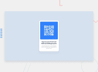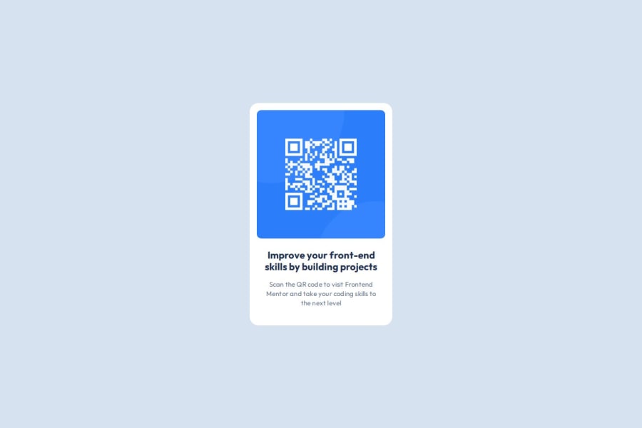
Design comparison
Solution retrospective
I'm proud of starting up with my Fronted Project journey. And I'm excited to solve more challenges and build cool projects in future.
What challenges did you encounter, and how did you overcome them?This challenge was quite easy. Only thing that was new to me, was how to approach a frontend project professionally. And how to setup environment for professional projects like setting up variables, etc.
What specific areas of your project would you like help with?I would like to know how the whole card is centered. I tried it using flexbox but it is not working in mobile version.
I would also like seniors to guide me about
- any mistake I had made.
- my approach of solving this challenge.
- would love to know if there's an optimal approach to solve challenges like this one.
Community feedback
- @MikDra1Posted about 2 months ago
If you want to make your card responsive with ease you can use this technique:
.card {
width: 90%;
max-width: 37.5rem;
}
On the smaller screens card will be 90% of the parent (here body), but as soon as the card will be 37.5rem (600px) it will lock with this size.
Also to put the card in the center I advise you to use this code snippet:
.container {
display: grid;
place-items: center;
}
Hope you found this comment helpful 💗💗💗
Good job and keep going 😁😊😉
Marked as helpful0
Please log in to post a comment
Log in with GitHubJoin our Discord community
Join thousands of Frontend Mentor community members taking the challenges, sharing resources, helping each other, and chatting about all things front-end!
Join our Discord

