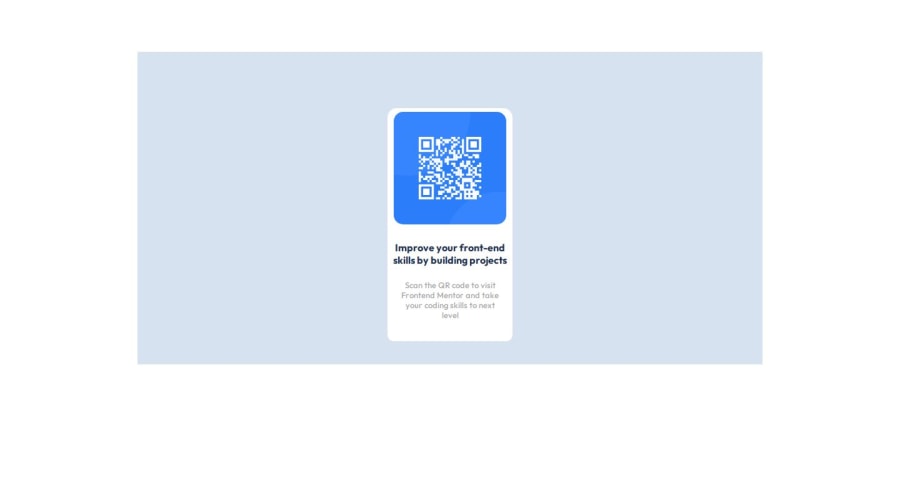
Design comparison
Solution retrospective
As a newbie, I'm so proud about myself thinking that I done the work without any help from other party except w3schools. Yeah, it's a simple design but as beginner it is a quite a task for me.
I give my heartfelt thanks to my mentor, Hasika Sandaruwan, for his unwavering dedication.
What challenges did you encounter, and how did you overcome them?-
Reading the readme and style guide. I'm not very familiar with reading docs and guides. But I think I did it well in this project.
-
Adjusting the border radius of the image - It's just a simple thing but I actually forgotten it. So I used w3schhols to solve it.
-
Importing and applying the recommended font family - I got the font from google font but I couldn't apply it. After I looked back at my old project and figured it out.
I think I didn't do well in fine tuning the paragraph text. It's recommended color(hsl(212, 45%, 89%)) is not showing properly in live preview. If someone can tell me how to do it, that would be great.
Join our Discord community
Join thousands of Frontend Mentor community members taking the challenges, sharing resources, helping each other, and chatting about all things front-end!
Join our Discord
