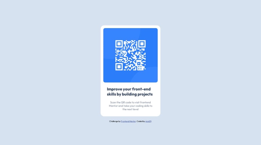
Design comparison
Community feedback
- @khushi0909Posted over 1 year ago
1)now if i see its okay for all the screen ,but for future to implement responsiveness you should learn more about media queries etc .
2)Read about h1 tag its the most important and every website should have atleast one https://www.semrush.com/blog/h1-tag/
3)you should learn about semantics HTML and using it for ex footer ,main etc
All the best
0@nicol29Posted over 1 year ago@khushi0909
Thanks for your comment,
I have an understanding on how to use media queries, however for this particular challenge I did not feel the need to use them.
In relation to the h1 tag, it is recommended that for every page you only have one h1 which is why I opted for the h3 tag instead. There would be other elements of higher importance on the page compared to this component.
Regarding semantics, this is very simple component which does not need a footer or main, maybe in this instance an article tag would suit as the container of the qr-code card?
0
Please log in to post a comment
Log in with GitHubJoin our Discord community
Join thousands of Frontend Mentor community members taking the challenges, sharing resources, helping each other, and chatting about all things front-end!
Join our Discord
