Design comparison
SolutionDesign
Solution retrospective
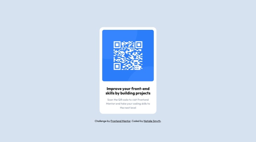
I struggle with keeping my CSS concise, which becomes a huge problem when working on more complex projects, so I thought it was a good idea to try to build this QR code and intentionally try to be as dry as possible. Any feedback on how I did or suggestions on how to not have a bloated css file would be appreciated :)
Community feedback
Please log in to post a comment
Log in with GitHubJoin our Discord community
Join thousands of Frontend Mentor community members taking the challenges, sharing resources, helping each other, and chatting about all things front-end!
Join our Discord
