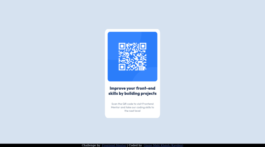
QR Component using CSS Flexbox (pure CSS3)
Design comparison
Solution retrospective
One of my biggest questions on basically every front-end project I work on is code organization and usage (according to best practices), so any form of feedback/critique would definitely be appreciated!
P.S: Just fixed the broken links :D
Community feedback
- @akhademikPosted over 2 years ago
nothing on both live and github. double check it again please.
Marked as helpful1@KaydenGiang2512Posted over 2 years ago@akhademik I noticed the issue. Please check again as everything is fixed now!
0@akhademikPosted over 2 years ago@KaydenGiang2512 This one easy so i have nothing much to comment about this. And about your question i have some tiny things:
- you have variables for colors but some places you use hsl
- for the naming classes maybe you should have a look at BEM
- try to avoid static values (px) because maybe somedays that will give you headache about responsiveness of the website. Happy coding :)
Marked as helpful0 - @FluffyKasPosted over 2 years ago
Hiya,
There isn't much to organise in this project as the code is super short >.< What you did seems very nice (class naming is good, css is very easy to read, etc).
I'd say you did great here. There's only a few things where you could improve regarding best practices:
-
I'd remove the unnecessary div wrappers around your title and paragraph. No need to wrap them. You can even remove the image wrapper div, there's no need for it but honestly this you can keep it if you feel more comfortable having an img wrapper.
-
Remove the width from the <body>, there's no need for it (you could give a width to your footer, as you already gave it a
position: fixed
). Same goes foroverflow: hidden
. If you have an overflow, mostly it means there's a bad coding practice somewhere that you need to fix (there are exceptions of course, but this one isn't). Your height should also be swapped formin-height: 100vh
. -
Don't center components with
position: absolute
. Flexbox or grid is a lot easier to use, it's less lines and it doesn't mess up the rest of your code. -
The flexbox you placed on your card can be removed entirely, the natural flow of element will display everything as a column anyway.
-
Except for borders and box-shadows you shouldn't really use pixels. Give relative units a try, rem is pretty straightforward to use, for example.
I hope this helped a bit, good luck ^^
Marked as helpful0@KaydenGiang2512Posted over 2 years ago@FluffyKas thank you so much for your feedback. It's been almost a year since I last worked with front-end stuff, so there were certainly mistakes along the way. I have a question though: I did try to center my QR card (the main tag) using flexbox, but for some reason it refused work in my favor. Would you happen to know why this was the case? Thanks again!
0@FluffyKasPosted over 2 years ago@KaydenGiang2512 You mean, flexbox didn't align the component vertically? Just use
min-height: 100vh
instead ofmin-height: 100%
. When I was playing around with your code I was actually having the same problem and it took me a fair few minutes to find the mistake >.<Marked as helpful0 -
Please log in to post a comment
Log in with GitHubJoin our Discord community
Join thousands of Frontend Mentor community members taking the challenges, sharing resources, helping each other, and chatting about all things front-end!
Join our Discord