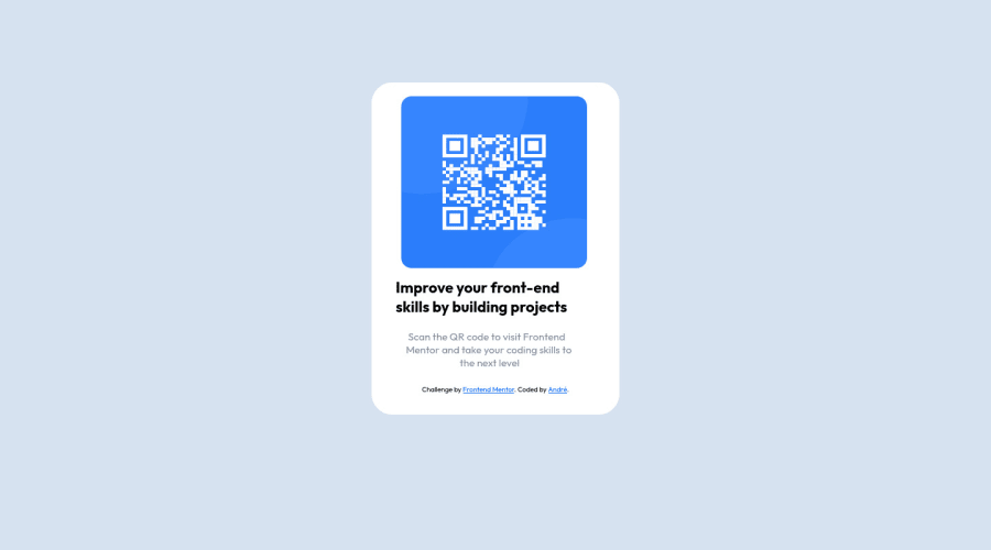
QR component using CSS and responsive design
Design comparison
Solution retrospective
How could I avoid putting negative values in the margins and so many media-queries? Thank you in advance!
Community feedback
- @kkulekPosted about 2 years ago
@andredomin congrats on delivering your first project here!!
Great start and if you would like to finish next project better try:
- Review materials on box-model
You're have such a pain with margins/paddings etc., because your component doesn't have a proper fundamentals.
Try to focus on: a) set a body on 100vh (100 viewport height = 100% of screen height, no matter if mobile or desktop)
and display elements inside of a body as flex: display: flex; flex-direction: column; (in this case no matter what you set - you'll have 1 container in the body) align-items: center; justify-content: center;
now you have fundations for the your component (it will be in the perfect center)
b) create container with proper width and height (invicible box for rest of a content) f.e.:
<div class=container> -> here will be all the content: img, headline, copy etc. </div>display content in this container with proper values, for example: display: flex; flex-direction: column; (this is important in your case: every item will be below previous) align-items: flex-start; justify-content: space-around (you'll have almost everything done in your "invincible box")
c) You can add a small padding for the copy if you want a pixel perfect delivery. And you're a one step closer to deliver next project a bit better :)
- Create components/webistes from the ground up. start with mobile and just add in bigger resolutions (@media) changes.
This way you avoid situation that a @media query for smaller resolution overrites many lines of code.
You can check code for this component of mine: site: https://kkulek.github.io/simple-nft-preview-card-component/ code: https://github.com/kkulek/simple-nft-preview-card-component
Maybe this will help you a bit.
PS. If you review informations about box model and basic flex, you start setting up projects with proper fundamentals - with them you will not have to hustle so much with margins ;)
Marked as helpful4@andredominPosted about 2 years ago@kkulek Thank you so much, it is a pleasure to receive this help when one is just starting out. I take note of everything you have told me!
1@kkulekPosted about 2 years ago@andredomin good luck Andrés! I'm a begginer too and I'm sure here is a greate place for practice and supportive community.
freecodecamp.org may be a great source of structured content (good quality & free)
I wish you patience and just keep eyes on the prize! Creating front-end on the good level is hard.
But humble attitude with solid work each day can help us improve :).
Study hard, each day a bit better...
2 - @kkulekPosted about 2 years ago
@andredomin: idk what happened with the formatting, but I hope that comment help you a bit.
As a suplement I'm reposting part of my other comment. I believe it could realy help you (it improved my understanding of basic concept within a 1-2 days).
PS. I've started 6 days ago here... this materials and focus on the fundamentals (i hope!) could help you improve fast :)
Repost: Maybe these 4-videos series would be good fit for you: https://www.youtube.com/watch?v=h3bTwCqX4ns
Kevin is doing a challenge from the frontendmentor.
Key takeaways: Setting a good :root (especially fonts and theirs corelation across resolutions) will save tons of a time - without that I was creating hudge mess in the CSS while working on @media queries.
Pixels aren't best idea when you want to work on the responsive project. Relatives are just better fit (here is few minutes about that topic: https://www.youtube.com/watch?v=_-aDOAMmDHI)
It's an obvious thing now, but wasn't before for me. Work on the project from the ground up: from the smallest resolution and add @media queries when needed.
Plan whole project in advance (all the boxes/containers, relation between resolutions etc.). 10-20 minutes on that saved me 1-3 hours on the other project, and I think it's a great practice even on small projects, to just be prepared for the bigger ones.
BEM (naming structure for the CSS): I'm still learning that (and making my mistakes), but use this or similar methodology to train and organize your CSS.
Good luck :)
Marked as helpful3@andredominPosted about 2 years ago@kkulek you are the best! This is the help i need to understand everything better! Love this feedback! Thank you! : )
1 - @imadvvPosted about 2 years ago
Greeting Andrés Domínguez!! Congratulations on completing Your First challenge!, 👏👏👏.
the negative margin itself has a use cases nothing wrong about using negative margins, However to control the layout it better to use either Flex or Grid, and avoid using hard coded width and height, use instead
max-width
ormax-height
if needed, for example if have acontainer
that you want to center it on the page you can do something like .min-height: 100vh; display: flex; justify-content: center; align-items: center;
or
min-height: 100vh; display: grid; place-content: center;
and use
margin
andpadding
to control the box-model itself not the layout .but over all, Happy Codding, and welcome to Frontend Mentor Community
Marked as helpful3@andredominPosted about 2 years ago@imadbg01 Thank you so much! This helps me a lot to improve! :)
1 - @Fola-JoePosted about 2 years ago
Nice work here. I believe you could make use of
text-align: center;
for your paragraphs. You could as well put in your content in a div or main(whichever you would like). After, setting your padding, saypadding: 10px
, you could set images towidth: 100%
Marked as helpful2 - @Fola-JoePosted about 2 years ago
I think with these, you won't need to set margins like you did. Also, you could do well with just one stylesheet. Happy coding 😇
1
Please log in to post a comment
Log in with GitHubJoin our Discord community
Join thousands of Frontend Mentor community members taking the challenges, sharing resources, helping each other, and chatting about all things front-end!
Join our Discord