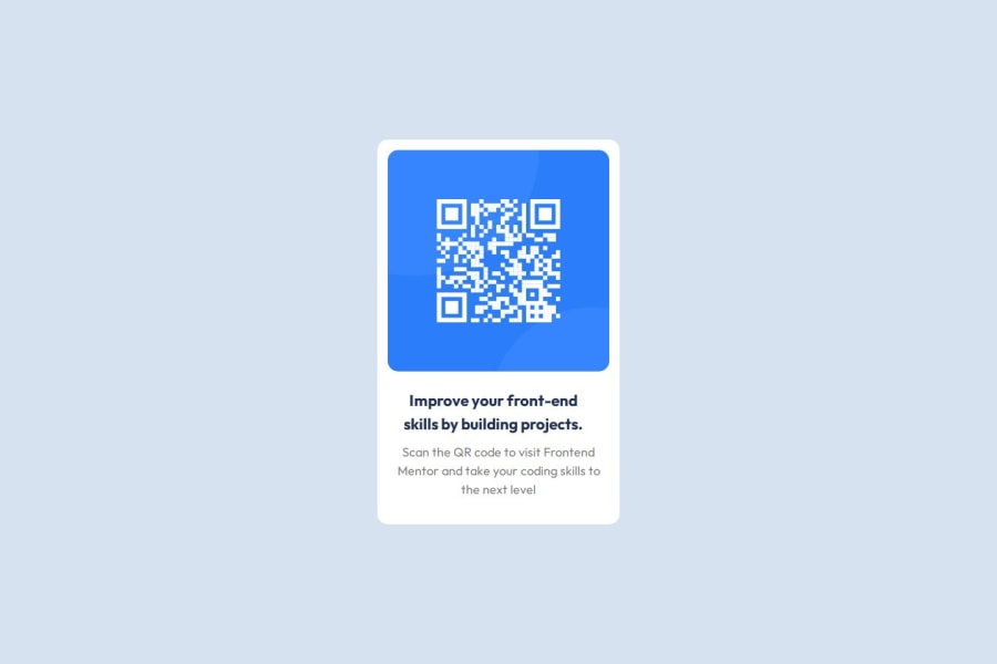
First Review Request - QR Code - Semantic markup, Grid, Flex
Design comparison
Solution retrospective
Hello all! This is my first submission to Frontend Mentor!
About: I've been interested in web development since the early 00's, but never gotten around to learning. Now, I'm working to change that!
QUESTIONS:
-
Is the markup semantic and accessible? I was unsure about how to markup the text on the card. I used an <H1> and a <span> for the body text. I suspect that the span should've been a <p> since it is content.
-
It was unclear to me whether or not to use <main> for the card itself, so I used a <div>. I haven't dealt with components, so I'm learning how to mark up and style them. I've only had experience writing traditional websites (back in the days when floats were all the rage) - not web apps.
TOOLS USED: CSS Grid, Flexbox, CSS Reset, and Custom Properties.
TO-DO: I tried to organize the CSS file in an easy-to-read manner, but I'm still working on it. In the next project, I plan to incorporate Cube.css. So hopefully that will organize things a bit better. Also read more about accessibility best practices.
I'll post this solution on Slack as well.
Thank you for your time is looking over my project!
Community feedback
- @FloratobyDevPosted almost 2 years ago
Hello Bvandyke, first off, good job on finishing the challenge! I checked your code and I see a lot of unnecessary processes you had to go through just to do this challenge. However, I don't see that as a bad thing, I think it's actually good if you're just starting out, to learn about all types of things. Watching Youtube tutorials is great but it's nothing better than actually doing the work yourself. Some things I'd like to point out though to make life a bit easier for you are the following :
- You can simply put
margin: 0
inside the*
selector if you just want it to be used by every selector. If not, then you can keep doing what you did here :
h1, h2, h3, h4, p, figure, blockquote, dl, dd { margin: 0; }
-
There's no need to add a
media query
about animation if you don't have one. But if you're just learning, then that's acceptable I guess. However, I don't know if you'll be able to see the difference if it doesn't show when you try and test it out. -
Also, you can just use
.card img
rather than.card > img
since you only have one img element.>
symbol styles all theimg
elements inside the.card
class so you may want to take note on that. It may cause you problems in the future.
I think that's all I can say. Other than that, well done, and keep it up! Keep learning! .
Marked as helpful3@ridge-runnerPosted almost 2 years ago@FloratobyDev Thanks for the fast response!
-
I was unsure about adding a media query, since the component didn't seem to change that much. I'm thinking about sticking to components for the next two or three projects before moving on to a larger layout.
-
Thanks for clarifying
.card img
vs..card > img
. I should've checked the docs for that, but didn't make a note and forgot. lol.
As for the CSS Reset, I didn't create it. I found it at Andy Bell's site Piccalil.li. I saw a "build along" with Kevin Powell on YouTube. He recommended it, so monkey see, monkey do, I suppose. I should've cited the author properly, anyway, so I'm glad that you brought it to my attention.
Thanks again! BV
0 - You can simply put
- @AdrianoEscarabotePosted almost 2 years ago
Hi Bvandyke, how are you? Welcome to the front-end mentor community! I really liked the result of your project, but I have some tips that I think you will enjoy:
To improve the responsiveness of the page we can do this:
.card { max-width: 375px; }
Add a padding to the body, so that the content in lower resolutions doesn't hit the edge of the screen!
The rest is great!
I hope it helps... 👍
Marked as helpful1@ridge-runnerPosted almost 2 years ago@AdrianoEscarabote
Thank you for the tip and warm welcome, Adriano!
I'll do more research on max-width, and work it into my next project. I didn't think of adding some padding to the body tag, so I'll make a note.
0 - @denieldenPosted almost 2 years ago
Hello Bvandyke, You have done a good work! 😁
Some little tips to improve your code:
- add
main
tag and wrap the card for improve the Accessibility - also you can use
article
tag instead of a simplediv
to the container card for improve the Accessibility - use
p
tag for the text of card and not aspan
tag - instead of using
px
use relative units of measurement likerem
-> read here
Keep learning how to code with your amazing solutions to challenges.
Hope this help 😉 and Happy coding!
Marked as helpful1@ridge-runnerPosted almost 2 years ago@denielden
Thanks Deniel for taking time to review my work!
After submitting the project, I noticed the Deque University reports, which recommended the changes. Lesson learned! However, I appreciate that you mentioned using
article
for the card. I missed that completely and it makes sense. That component could be considered stand-alone content.As to using px, yeah, I agree. I'm still developing a feel for the "new" responsive units. Looks like I have some reading and practice to do!
0@denieldenPosted almost 2 years ago@ridge-runner You are welcome and keep it up :)
1 - add
Please log in to post a comment
Log in with GitHubJoin our Discord community
Join thousands of Frontend Mentor community members taking the challenges, sharing resources, helping each other, and chatting about all things front-end!
Join our Discord