

Design comparison
SolutionDesign

Solution retrospective
What are you most proud of, and what would you do differently next time?
I am proud that this did not take too long and my initial ideas of how to divide the project worked well. I would look at the style guide earlier than I did.
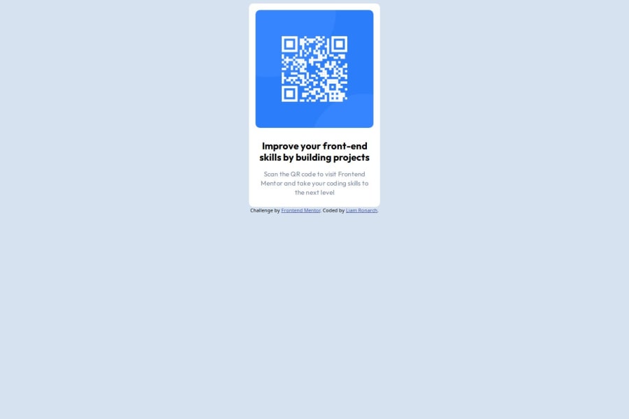
What specific areas of your project would you like help with?Centering the main part of the project. I already used display: flex, align-items:center, justify-content: center on the parent of the main container I used to hold the QR code, so I was unable to figure it out.
Community feedback
Please log in to post a comment
Log in with GitHubJoin our Discord community
Join thousands of Frontend Mentor community members taking the challenges, sharing resources, helping each other, and chatting about all things front-end!
Join our Discord