Solution retrospective
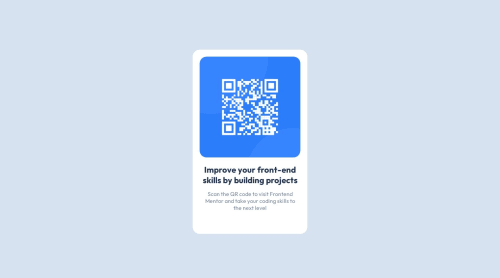
I'm happy for my first try but i am sure there's a lot of room for improvement.
The margins for the two paragraphs below the image somehow took much of the time. Is there an easier way without defining specific margins for the text?
Code
Loading...
Please log in to post a comment
Log in with GitHubCommunity feedback
No feedback yet. Be the first to give feedback on Stefan's solution.
Join our Discord community
Join thousands of Frontend Mentor community members taking the challenges, sharing resources, helping each other, and chatting about all things front-end!
Join our Discord