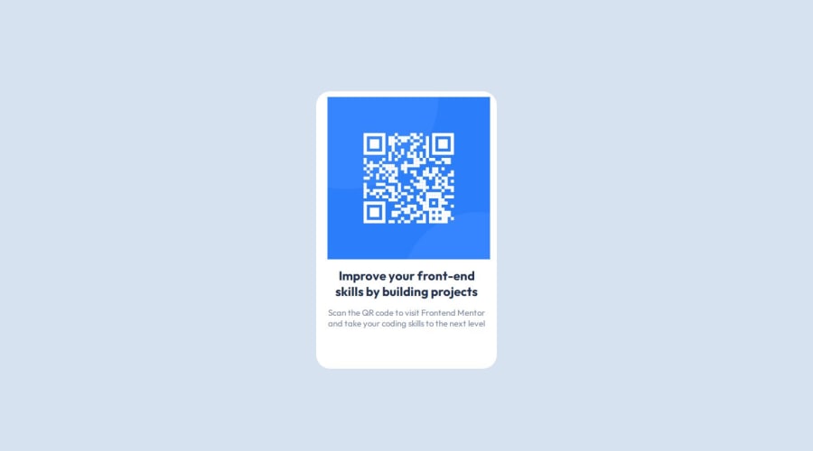
Design comparison
Solution retrospective
Enduring through and learning to implement the
display: flex properties (justify content, align-items). Took me a while to actually get it to work and wrap my head around it, specially within nested elements, but I managed.
I'd definitely start trying it out sooner next time - I spent a couple of hours at least trying to get elements to center using only margin, padding and position properties.
Getting flex to work!
I overcame it by practicing with the wonderful Flexbox Froggy - an intuitive game, very useful as a starting point, as well as multiple practicing exercises at over at W3 schools CSS tutorial
What specific areas of your project would you like help with?My image is simply refusing to align with my div-background element, for reasons that I simply can't wrap my head around. Tried a lot of different margin, padding, positions values, played around with different align-items and justify-content values, but nothing worked.
I do admit I tried brute forcing it by setting values, running live-server and checking in the hopes of getting it to work, but, unfortunately enough, nothing worked, and I also recognize this is not the best way to actually understand things.
Community feedback
- @IrieBeePosted 7 months ago
Hi @Jirobow,
Nice job on your first project!
You can try to add to the
body{min-height: 100vh; align-items: center;}Have a good weekend and happy coding
Marked as helpful1
Please log in to post a comment
Log in with GitHubJoin our Discord community
Join thousands of Frontend Mentor community members taking the challenges, sharing resources, helping each other, and chatting about all things front-end!
Join our Discord
