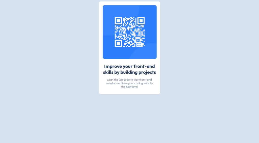
Design comparison
Solution retrospective
All feedback will help me. Thanks!
Community feedback
- @redcaledonianPosted over 2 years ago
Try using CSS Grid or flexbox to center the div on the page. Avoid using absolute px, use EM or REM instread as this will ensure everything scales correctly on different screens.
1 - @HinaSejaru124Posted over 2 years ago
The align attribute on the p element is obsolete. Use CSS instead. Also, use display: flex and align-items: center to your body to make your card centralised vertically
0 - @correlucasPosted over 2 years ago
👾Hello Ali, congratulations for your solution!
Your component is really good done, but there are some fixes you need to apply in order to have it responsive and aligned.
To align the component you'll need to remove the margins and use
flexboxandmin-heightinside the body to make the container align to as it is the direct child from the body.body { background-color: hsl(212, 45%, 89%); min-height: 100vh; display: flex; align-items: center; justify-content: center; } .box { display: block; background-color: hsl(0, 0%, 100%); max-width: 340px; padding: 16px; /* height: auto; */ border-radius: 10px; /* margin-left: auto; */ /* margin-right: auto; */ }To make the image responsive too you'll need
max-width: 100%anddisplay: blockin order to have the image growing 100% of the container minus the padding.img { max-width: 100%; display: block; /* width: 300px; */ border-radius: 10px; /* margin: 21px; */ }See if works for you and keep it up!
0
Please log in to post a comment
Log in with GitHubJoin our Discord community
Join thousands of Frontend Mentor community members taking the challenges, sharing resources, helping each other, and chatting about all things front-end!
Join our Discord
